Before jumping into designing straight away, I want to do a bit of research on successful posters and leaflets to get a vague idea of how to lay out my own design. I found the two template designs below and I think they're quite modern and really slick. I think these two layouts have made me consider colour, as these leaflets work as they're bold and eye-catching.
I think this leaflet design is also incredibly slick and modern. From researching, I think I have found that I personally think modern leaflets are a lot more interesting to look at and pleasing to the eye, so for this reason I plan on creating my own leaflet in a modern style.

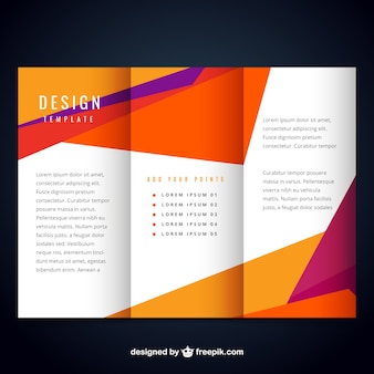
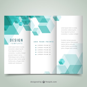
I then found these leaflet designs. I think that these designs are incredibly successful as they're interesting to look at as the colours are eye-catching and contrasting. I would really like to create something inspired by these leaflet designs, however I'm unsure if I'll have the space on the leaflet design that I have chosen.

I found this design for a poster and I think it's really interesting as it is really eye-catching even though it is in black and white. I think this is because the poster is quite offset and therefore it works as a design. I think the layout of the typography is really effective as it's minimal and spaced interestingly.

Finally, I found these poster designs on Design Inspiration. I think that these are really nicely designed and the negative space is really pleasing to the eye. Personally, I'm not a fan of the typeface used, however I think Helvetica would've worked a lot more successfully.

No comments:
Post a Comment