Thursday 31 March 2016

OUGD505 Product Range Distribution - Feedback (Studio Brief Two)

In the studio today, I told people my ideas and asked them to tell me which they think would be the most successful. I have numbered the concepts and ideas, and the comments and feedback are below.

1. Leave weeds.
Instead of advertising weed killing pesticides, create a new product that would be sold, but it would actually only be water inside, therefore instead of killing the weeds, it would make them grow. This would encourage bees and other wildlife to come into the garden, which in turn will help the bees thrive.

2. Food stall.
Brand and create a food shop that would sell mostly products that have been produced through bees pollination. This is different than anything I have seen that is bee-related on the internet.

3. Bee feed.
Brand and package a new product that would be sold on the pets isle of supermarkets. Inside the bottle would be sugar water, however it would be advertised as bee feed. This is something that no one is yet to create, however it's probably handy to have around the house for when the bees are dying at the end of summer. The sugar water is said to give the bees more energy and can actually save their lives.

4. Smoothie Company.
This idea is similar to the food stall, however it would make the product more accessible as it could be sold in supermarkets. The ingredients in the smoothie would be 100% pollinated by bees.

FEEDBACK:

3. I think it's an original idea. I bet Danny will love that idea.
1 or 4. With the first, you'd have to be very careful how you would package it, however, as it would be false advertising. I think it's safer to go with the fourth concept.
4. I agree with Izzie, the first would be very difficult and the fourth idea seems the strongest.

As I prefer the fourth concept myself, this is the concept I am going to take forward. I think it will be the concept that I can create the most designs with and also have the most fun with. I also think the concept is really strong and this will definitely help with my design process and production.

OUGD505 Product Range Distribution - Possible Concept Ideas (Studio Brief Two)

Leave weeds.
Instead of advertising weed killing pesticides, create a new product that would be sold, but it would actually only be water inside, therefore instead of killing the weeds, it would make them grow. This would encourage bees and other wildlife to come into the garden, which in turn will help the bees thrive.


Food stall.
Brand and create a food shop that would sell mostly products that have been produced through bees pollination. This is different than anything I have seen that is bee-related on the internet.

Bee feed.
Brand and package a new product that would be sold on the pets isle of supermarkets. Inside the bottle would be sugar water, however it would be advertised as bee feed. This is something that no one is yet to create, however it's probably handy to have around the house for when the bees are dying at the end of summer. The sugar water is said to give the bees more energy and can actually save their lives.

Smoothie Company.
This idea is similar to the food stall, however it would make the product more accessible as it could be sold in supermarkets. The ingredients in the smoothie would be 100% pollinated by bees.

Possible names: stigma, root, ocelli, sting/stinger

OUGD503 Individual Practice, Brompton Bikes - Evaluation (Studio Brief One)

This is a brief I discovered via an email from university. The brief required me to create a 15 second video that would be uploaded to Instagram. I had never participated in an Instagram competition before and this seemed like a really interesting competition to start with.

A strength of this project definitely has to be the sheer amount of time I put into it. The bicycle alone took my multiple weeks to complete, as it was incredibly fiddly and the rolls of paper had to be the perfect size, meaning I had to make multiple variations of each section of the bike, for example the handlebars took me 3 attempts to get to the right proportion size. I believe another strength of this project was the concept. Most of the videos I had researched into already submitted to the competition didn’t have an added concept, which I believe gave my video an edge. The concept I came up with was also portrayed very clearly in the final video outcome. 

A weakness of this project was actually nothing I could’ve helped. It was Instagram’s video formatting, which made my huge video look quite pixellated and actually stretched my video so it wasn’t as crisp. This was infuriating and I tried multiple different times to submit the video as different sizes, however nothing stopped this from happening. 

Overall, I think this project was a great success. It was insanely time consuming, however I'm really proud of the final outcome. If I were to do this project again, I would definitely do a collaboration as this project was huge and took up a lot of my spare time. However, I believe this brief will look incredible in my portfolio, as it shows off multiple different skills, such as paper cutting and video production.


Wednesday 30 March 2016

OUGD505 Product Range Distribution - Research, Specific Bee Pollination (Studio Brief Two)

Whilst looking into bees, I came across a list of all of the plants that are pollinated by bees. This list is below. I decided to include this in my research as it may come in handy when coming up with a concept for my project. The list is below.

  • Apples
  • Mangos
  • Rambutan
  • Kiwi Fruit
  • Plums
  • Peaches
  • Nectarines
  • Guava
  • Rose Hips
  • Pomegranites
  • Pears
  • Black and Red Currants
  • Alfalfa
  • Okra
  • Strawberries
  • Onions
  • Cashews
  • Cactus
  • Prickly Pear
  • Apricots
  • Allspice
  • Avocados
  • Passion Fruit
  • Lima Beans
  • Kidney Beans
  • Adzuki Beans
  • Green Beans
  • Orchid Plants
  • Custard Apples
  • Cherries
  • Celery
  • Coffee
  • Walnut
  • Cotton
  • Lychee
  • Flax
  • Acerola – used in Vitamin C supplements
  • Macadamia Nuts
  • Sunflower Oil
  • Goa beans
  • Lemons
  • Buckwheat
  • Figs
  • Fennel
  • Limes
  • Quince
  • Carrots
  • Persimmons
  • Palm Oil
  • Loquat
  • Durian
  • Cucumber
  • Hazelnut
  • Cantaloupe
  • Tangelos
  • Coriander
  • Caraway
  • Chestnut
  • Watermelon
  • Star Apples
  • Coconut
  • Tangerines
  • Boysenberries
  • Starfruit
  • Brazil Nuts
  •  Beets
  • Mustard Seed
  • Rapeseed
  • Broccoli
  • Cauliflower
  • Cabbage
  • Brussels Sprouts
  • Bok Choy (Chinese Cabbage)
  • Turnips
  • Congo Beans
  • Sword beans
  • Chili peppers, red peppers, bell peppers, green peppers
  • Papaya
  • Safflower
  • Sesame
  • Eggplant
  • Raspberries
  • Elderberries
  • Blackberries
  • Clover
  • Tamarind
  • Cocoa
  • Black Eyed Peas
  • Vanilla
  • Cranberries
  • Tomatoes
  • Grapes

OUGD505 Product Range Distribution - Research, Pollen (Studio Brief Two)


Pollen is a powdery substance which are male microgametophytes of seed plants, whch produce the equivalent of male sperm cells. Pollen grains have a hard coat made of sporopollenin that protects the sperm cell (gametophytes) during the process of their movement from the stamens to the pistil of flowering plants or from the male cone to the female cone of coniferous plants. If pollen lands on a compatible pistil, it germinates, producing a pollen tube that trasfers the sperm to the ovule containing the female gametophyte. Individual pollen grains are small enough to require magnification to see detail. The study of pollen is called palynology and is hughly useful for archaeology and forensics.

Pollen in plants is used for transferring haploud male genetic material from the anther of a single flower to the stigma of another in cross-pollination. In a case of self-pollination, this process takes place from the anther of a flower to the stigma of the same flower.

Tuesday 29 March 2016

OUGD503 Individual Practice, Brompton Bikes - Submission (Studio Brief One)

Here is a link to my Instagram submission.


https://www.instagram.com/p/BDioKM0rhz_/

Uploading this video to Instagram was actually a lot more irritating than I thought it was going to be, as it made my video squashed and therefore it lost a lot of quality. I tried and tried to get around this by changing the size of my video to fit Instagram's photo format, and also tried cropping it both on Photoshop and on my phone. None of the things I did helped fix the quality of the video, so I had to just upload it with a lower quality. This was frustrating, as I think it made my video stand out a lot less than it would've originally.

Monday 28 March 2016

OGUD503 Individual Practice, Brompton Bikes - Final Video (Studio Brief One)

These are the still images taken from the re-shoot. The lighting of these shots is a lot more successful than the original video. It also has a lot less images, which I think is a bonus, as the original attempt was 15 seconds, and this will be shorter, meaning I will be able to add extra information to the video, such as the concept idea, the Brompton logo and the hashtag.


This is the final video of stills. I think it's definitely successful as the concept is clear, all I need to do now is add the information and some music.


This is the final video I created. I used the song Queen - Bicycle Ride. I think it's very successful as it it fits with the brief, in the sense it shows my city and it is below 15 seconds, but also because it has a secondary concept. 

OUGD505 Product Range Distribution - Research, Existing Websites (Studio Brief Two)

Before I decide on a concept, I think it will be helpful to look into what information is already available through relevant websites. This website below is part of GreenPeace. This website is definitely the most informative website online and it's the most appealing as the information provided is concise and straight to the point. It is also useful as it is the main website that talks about the situation, the causes and the solution. The website is also appealing to a younger demographic as it uses illustrations and it is worded simply. 

http://sos-bees.org/


The next website I visited was called Help Save Bees. The website is very informative, however it is designed very poorly and is incredibly simplistic. This could be seen as successful, as it shows that the information is the main reason that the website exists and it is straight to the point, however it could be a lot more complex and still put across the same, strong message, if not stronger.

http://www.helpsavebees.co.uk/bee-intro.html


The next website I came across was a link on the website Friends of the Earth. This website wasn't too informative and the only real information it provided was a link to buy a Bee Saver Kit. This is a really great concept and I know people that have purchased this kit, however it would probably sell a lot more if there was more information about the cause, for example, this website doesn't specify where the money will go once the kit has been bought, and for £15 a kit, this is something that should definitely be explained. The colour scheme is black and yellow, which is very typical for a website about bees, however it's very contrasting and eye catching, so for that reason it works successfully.

https://www.foe.co.uk/page/get-your-bee-saver-kit


The webpage below is called Save Our Bees and was set up specifically for that campaign. The design of the website is really abstract and nothing seems to fit right. The colour scheme doesn't fit well together at all, and the typeface used for the header isn't very legible. This website's information is very informative and interesting, however it is definitely let down by the design. It's a very old design and could definitely use a revamp. 

http://www.saveourbees.org.uk/


This is the final website I looked at - there are hundreds more. Similarly to the previous, the colour scheme and overall layout is very old fashioned compared to new web design. This company is a good company, however, as it is clear that the website is against the misuse of harmful pesticides.

http://www.savehoneybees.info/


Although I probably won't be designing a full website as the main part of my project, however looking through the websites that are already online was very helpful, not only for information, but for colour schemes and patterns to avoid - something I have previously discussed.

OUGD503 Individual Practice, Secret 7 - Results (Studio Brief One)

Unfortunately, I didn't make it into Secret 7 with either my physical submission or with my digital submission. This is quite disappointing as I was really proud of my final responses, however I will try again next year. It's getting more and more difficult to be successful with Secret 7, as they get hundreds more submissions each year.


Sunday 27 March 2016

OUGD505 Licence to Print Money - Design Boards (Studio Brief One)


OUGD505 Product Range Distribution - Feedback / Tutorial (Studio Brief Two)

Today I had a tutorial with Danny and I discussed my idea for my project. At this point, I still don't have a specific concept, however I found the tutorial very helpful as he confirmed that I should definitely stay away from the use of yellow and black, and also refrain from using hexagons in my design. I definitely agree with these comments as they are very overused in all of the design I have seen so far, infact I'd say around 90% have used a similar colour scheme or hexagons.

Another thing we discussed was the number of websites about Save The Bees, this is something that I have already looked at. There are hundreds of different websites, each giving only a little bit of information. It would be good to create a website that had all of the information available and all of the ways to get involved on it too. This could be kept up to date with a blog.

OUGD503 Individual Practice, Brompton Bikes - Feedback (Studio Brief One)

Before re-filming either one of the videos, I wanted to get some opinions on both videos created so far, and if there was any way they could be improved. I am currently at home, so I can only really ask for feedback from people across different art specialisms, such as photography, illustration and textiles.

People said they thought that the first video was definitely the most successful, however they said to definitely re-film it and to focus more on the colours of the film so it doesn't lose quality when making it brighter like it did in the first attempt. They also said I should try avoiding fishing wire if I can, as in some shots it has caught the light and it's very visible.

One person said they preferred the second video because it makes it more obvious that it has all been cut using paper, however I personally still prefer the way the first video is filmed, even though it's a lot more tedious, so this is the idea I'm going to recreate.

Saturday 26 March 2016

OUGD503 Collaborative Practice, Desperados - Design Boards (Studio Brief Two)


OUGD505 Product Range Distribution - Research, Other Campaigns (Studio Brief Two)

It could be helpful for my own development to look into some other activist campaigns that are trying to save other animals. Save Smooshi is a campaign based in Canada, aimed at Marineland that aims to get the animals better treatment, and even better, released back into the wild. Marineland have been well known for the mistreatment of animals in Canada, which is what sparked the campaign. This particular campaign was started by an activist called Philip Demers, who is an ex Marineland employee. Demers is mainly fighting for the freedom of a walrus called Smooshi. This campaign is actually very close to my heart, and when I was younger I designed the logo, however I realise now that it is too friendly a logo to be taken too seriously and has quite a child-friendly feel. The campaign is mainly promoted through the use of social media and protests.


Blackfish is a similar campaign, which was actually the campaign that started the Save Smooshi campaign. Blackfish was originally a documentary about Seaworld's corruption and mistreatment of killer whales, however after being a huge success, many people now follow Blackfish as an activist campaign. It was a really great documentary as it really showed the contrast between what Seaworld said about their Orca's, and the truth.


WWF is an ongoing campaign for the treatment of all animals. They have a wide range of different animals that can be adopted and donated towards, and each donation goes towards the treatment of the animals and keeping the habitats of the animals intact. They are also activists for Climate change, illegal wildlife trade, poverty and the environment. They're probably the most well known animal activist website in the world.


Friday 25 March 2016

OUGD505 Licence to Print Money - Reflection (Studio Brief One)

Overall, I think this project went really successfully due to the fact that my design response was very well informed. A huge part of this project was research, as I wanted the concept of my design to be really strong, as the banknotes that I had researched all had very strong concepts, such as Alask Gurholt Ronse. I found the project really interesting as I got to research into the migrant crisis, which is something I didn’t know lots about at the time, and researching it has really opened up my eyes to the sheer terror that is happening in certain countries across the world. This research definitely influenced my design process, as I designed my bank note in a style I have never really experimented with - illustration. I chose this style due to the friendly appearance, however below the design, there is a strong message.

My time management of this project was actually quite poor due to the fact other modules were due to be submitted around the time. This is definitely a fault on my behalf and something I will look to improve on in the future. To do this, I will plan strict timetables in which the work has to be completed by, and also make sure that I keep up to date with my blog, as this is something I hadn’t been doing, meaning I had to go back and research specific subjects and imagery that I had already researched, ergo wasting more time.

A strength of this project was definitely the final product. I’m really happy with the final product as I think it comes across as I had planned - very friendly and inviting. I had a fear of actually doing the screen print due to the use of three different colours, meaning it could go very wrong, however I did manage to get one final, successful print. The misprints also don’t look too bad due to the playful nature of the type and imagery. 


In the next studio brief, I am definitely going to try screen printing something else, as I put it off for so long in this project and in the end I really enjoyed it and I was really impressed with the final outcome. 

OUGD505 Product Range Distribution - Research, Bee-Related Branding (Studio Brief Two)

For this project, the chances are I will have to design a logo, as I will most likely be creating some sort of brand. Due to this, I think it will be beneficial to look at some bee-related branding that already exists as it may give me some inspiration for my own project, and it will also help me realise further if I need to avoid using specific colours / shapes like previous projects that I have looked at did. I found the branding below on the website designinspiration. This logo is really satisfying to look at and has been very well executed, as the logo design links up to make a very interesting pattern, which has been embossed into the background. The colour scheme is quite an obvious choice - black and yellow, however this has been informed and it is very striking and bold. Having had a quick look through designinspiration, it is clear that the most successful logos of bees are very simplistic and minimal - this also is successful as it will work on smaller and larger scales without losing detail - this is something I will definitely consider for my own logo design.


I also found this branding on designinspiration. This logo is designed beautifully and fits really well with the overall aesthetic of the label. The typeface Helvetica is used to give off a very modern, minimal feel to the design, showing that the most important part of the product is what's inside - the honey. It's 100% pure honey, which is represented with the pure, black and white design of the packaging. 


I found this project on Behance. It was designed by Tara Rego, a designer based in Madrid, Spain. The logo design is mainly type, except for the fullstop which is a hexagon. The branding for this project is very strong and it gives a real feel of the restaurant through the use of colours and imagery. The logo design is quite simple, being mainly typography except for the hexagon shape used for the fullstop. After previously looking through different products, it's clear that the use of the hexagon shape is something that has definitely been overused, however it seems to work for this brand.

https://www.behance.net/gallery/34023854/Bee-Bar-e-ristorante-veg


This is the logo design for BEEloved, which was designed by Tamara Mihajlovic and Njegos Lakic Tajsic. The logo design is very informed as it is based on both the bee form and diamond lines. The logo design works very well as just the illustration, however it has been ruined by the use of the outer circle. The colour scheme is black and white, which I believe is very successful for the brand, as it doesn't deter attention from the packaging design.

https://www.behance.net/gallery/7297839/BEEloved-honey


The below logo was designed by Daniel Garcia, who is based in Chicago in the USA. The logo was designed for a Mexican brand who is decicated to natural beekeeping, organic honey and other honey-based products. Their approach was to create a transparent and honest design system that portrays the certified organic honey production processes that the company stand for. The logo uses simplistic, clean lines, which aim to reflect and honour the elegant touches of sophistication that the company uses. The colour scheme represents hope, general excellence, purity and therapeutic properties.

The logo design is really slick and minimal which definitely works for the brands ethics and overall aesthetic. The logo design definitely adds an element of class and sophistication to the brand, and it is very clear to see that the brand is organic and uses natural processes due to the colour scheme, and also the use of lines. 

https://www.behance.net/gallery/30359787/Esperanza

Thursday 24 March 2016

OUGD505 Licence to Print Money - Distribution (Studio Brief One)

The target audience for my brief was everyone in the UK, whether the viewer is a tourist or local. However, my defined target audience was specifically tourists, immigrants and younger children, as this is the demographic that would need to know this kind of information.

I chose to keep the design very light-hearted and the colour scheme gave it a very British theme, which meant that the bank note wouldn't attract attention from racist people who would think that the notes had been changed specifically for the migrants.

The stock chosen for the banknote was mainly chosen due to the fact it was screen printed, and therefore needed to be thick enough not to become crinkled with the three layers of ink. It would've been interesting to screen print the design onto acetate, however this takes twice as long to dry and I didn't manage my time well enough for this to be achieved.

The banknote would be distributed as any other bank note - it would be printed and then used in exchange for goods. The banknote would aim to bring a bit of lightheartedness when people accidentally got the British etiquette wrong, as many Britons get very annoyed by this.

OUGD505 Licence to Print Money - Development, Final Screen Print (Studio Brief One)

These are the final screen prints (before cropping). They're successful as the colour came through the screen really well, and they are very informed designs. The primary and secondary concepts are both strong and it really depends how the viewer wants to see the concept. I left this up to interpretation on purpose. I think these designs will look a lot better once cropped, and then I will choose which will be the design that I submit, as some of these prints are quite off, as it was quite difficult to line three prints up perfectly. Luckily, before printing, I did put a border around each layer with a 3mm bleed, meaning there was room for mistakes, and the actual design didn't have to be too precise, as the original design was intentionally quite roughly designed so that it would appeal to children.


Wednesday 23 March 2016

OUGD505 Product Range Distribution - Research, Manchester Bees (Studio Brief Two)

http://manchesterbe.es/


The bee has been a symbol of Manchester since seven bees were incorporated into the city's coat of arms in 1842. At the time, Manchester was at the centre of the Industrial Revolution and the bee is an ancient symbol of industry. It's the most common insect to appear on coats of arms, so the incorporation into Manchester's design was an obvious inclusion. Their placement over a globe highlights Manchester's global links at the time, with 60% of the world's cotton being processed in Manchester, 80% of which came from America.

As a demonstration of civic pride, the city's coat of arms began being incorporated into many buildings being built around this time, which is why it can be found on many buildings across the city, which can be seen if you look up when you walk around. It's from this starting point that the bee became an important emblem of the city.

The Manchester Bees project began in June 2012, and aimed to find out how many bees there are to find around Manchester City Centre. As the project developed, it was obvious that the bees had become integrated into the fabric of the city and its people. From street art, to tattoos, to business logos and clothing designs, the bee has become increasingly popular in recent years.

Gareth Hacking is a Manchester based photographer who has been documenting Manchester for the past ten years.

Tuesday 22 March 2016

OUGD503 Individual Practice, Brompton Bikes - Video & Production (Studio Brief One)

As the concept for my project was the fact that you don't have to pedal as much in Leeds due to hills, I had to somehow incorporate this into my video. I decided the best way to do this would be to film the stop motion with the camera on a slant. These are the stills that I took from the first video attempt. I knew that stop motion was incredibly time consuming, however I didn't expect it to take me that long to film it. It took me at least an hour to take around 60 stills, just because I had to keep moving the bike and making sure the bike hadn't jumped too far/ not moved enough. The main problem with this particular video is the fact that it is so dark, which I didn't realise until after filming as I was doing my test shots at the starting place of the stop motion and not the end - it gets darker and darker as the stills go on - I'm just hoping I will be able to fix this in Photoshop without losing too much detail.


This is the video of all the stills together, edited and put together using Photoshop. I think the editing to the video has definitely helped with the dark images, however I will probably film it again, just to make it the best it can possibly be. 


These are the photos I took from the second idea. It still follows the same concept, however instead of using just paper, I used my hand and filmed myself moving the bike along the set. This was actually a lot more easy to do, as the bike wheels do spin on their own. Again, the stills are a little dark - although not quite as dark, but hopefully I will be able to edit this out when I come to make the video.


This is the stop motion video created as a second attempt. I don't think it's very successful as my hand moves around far too much, although the colours are definitely better. I am going to re-film the original attempt and hopefully fix the colours by playing with the camera settings some more.


Sunday 20 March 2016

OUGD505 Product Range Distribution - Research, Bee-Related Products (Studio Brief Two)

I still don't have a strong concept as of yet, so I decided it would be useful to look into packaging design, as after looking into Burt's Bees, it is clear that having an actual product can definitely help get attention and traffic to a website, so this might be beneficial for my own project. To do this, I thought it would be best to look on Behance, as this is a website that is very useful as it tells the designer and the concept behind the design. It might help my own idea generation knowing the concept behind some projects. The first project I have found is called Hexagon Honey and was designed and created by Mark Arbuzov and Pavel Gubin, who are designers based in Moscow, Russia. 

"Natural forms is the best way to show naturalness of product. You need to have only form that to understand what is inside the package. Honey must look like honey. That is why this package is so clean and simple. You have to enjoy the smell and taste of honey. Nothing more should bother you."

I think this concept is very strong, and the designers are right - it is very apparent that within the bottle is honey, and it looks like a very expensive honey. The packaging adds value to the product. The colour scheme also works really well, as it is clear that the honey is the main focus of the product, not the actual packaging. The shape of the bottle is key to informing that inside is honey, not so much the packaging design.

https://www.behance.net/gallery/11750165/Hexagon-Honey


The next project I found was Busy Bees Bachelor Thesis, which was designed by Vanessa Schnurre, a designer from Kiel, Germany. 

"The awareness campaign „Busy Bees“ is the implementation of the thesis "Information graphics as an instrument for sustainable communication" and is engaged with the prevailing mass death of honey bees. So as to acquire a well-founded communication concept the theoretical part of this work analyses the influencing factors that hinder an effective communication with society and elaborates the factors that are essential for an efficient conception and presentation of information graphics. The campaign aims to illustrate the function and significance of honey bees and the part they play in our ecological system. Furthermore, it communicates the sensitivity and endangerment of this dependency as an imminent risk. „Busy Bees“ arouses interest and requests assistance at the same time. The communication strategy used for this purpose is based on the following guiding idea: „Motivation instead of depression.“ Information graphics are the campaign’s picture language and information carrier."

I think the design of the thesis is very relevant and it is very clear from first glance that the project is about bees. The choice of stock is also chosen very carefully, as it seems to be printed on recycled paper, which was chosen to show the nature-esk feel of the thesis. 

https://www.behance.net/gallery/13535747/BUSY-BEES-BACHELOR-THESIS


This project is called Bzzz Honey and was designed by Backbone Branding and Stepan Azaryan, who are design studios based in Armenia. I really like the packaging for this project, however I'm not a huge fan of the logo design. However, the logo and packaging design did end up winning a number of design excellence awards. It's clear to see that there is a definite pattern emerging between branding around bees, as the ones I have looked at so far are all similar colour schemes and all seem to focus around the hexagon, honey comb pattern. This is something I should definitely aim to avoid when designing my own project, as I want my project to stand out from the rest.

https://www.behance.net/gallery/3159306/Bzzz-honey


This publication is entitled 'All for one - God Save the Queen' and is a thesis created by Steffi Golla who is based in Vienna, Austria. The aim of the project was to show that honey bees achieve incredible things during their short lifespan. I think this has definitely been achieved through the multiple publications, and they all work incredibly successfully as a set. The binding method is very well informed, as it is based on part of the honey bees home - the slots that usually would have honey comb inside. The colour scheme is also relevant, as is the hexagon design, however as I have previously mentioned, this is very overdone with anything designed that relates to bees.

https://www.behance.net/gallery/2426304/Eine-fuer-Alle-Lang-lebe-die-Koenigin


This is a product designed by the designer Laurence Gregoire who is based in Montreal. This is a design that stands out for me from the rest as it doesn't use the same repetitive hexagon pattern, however it does still use a very obvious colour scheme - however, I believe this is just because it is an informed design choice. The actual logo is very slick and fits really successfully with the packaging design.

https://www.behance.net/gallery/31901737/Miel-Urbain


From researching all of these products, I think it's obvious that I definitely won't use a hexagon pattern within my own design as it's very overdone. I will also refrain from using solely black and yellow, as this is also a very obvious choice, and although successful, makes all the products look very similar. 

Saturday 19 March 2016

OUGD505 Product Range Distribution - Research, Burt's Bees (Studio Brief Two)

Burt's Bees is a company that came about in 1984, when an artist called Roxanne Quimby was hitchhiking and was picked up by Burt Shavitz, a local man who's beard was well-known at his roadside honey stand. Roxanne and Burt instantly hit it off, and before long Roxanne began to make candles from Burt's unused wax for the beehives. They made $200 at their first craft fair, and within the year they had made $200,000. 

The idealogy of the brand is pretty simple; what you put on your body should be made from the best that nature has to offer.


The brand is very good, as not only does it create amazing, ethical products - for example, the packaging is all recyclable - it also has a campaign behind it to help the bees. On the website, is a link where people can learn more about helping the bees. It's a particularly good way of promoting the save the bees campaign, especially as people would originally visit the website for the product. It's a campaign that is hugely helped due to the product, as the product is very popular, and therefore the campaign doesn't have to have advertisements specifically for saving the bees.

This is something I will definitely consider, as most people would prefer to get a product and help the bees, instead of donating and getting nothing in return. It is also good that this is a hugely trusted company, so people trust that their money is in safe hands and doing good.

Friday 18 March 2016

OUGD505 Product Range Distribution - Research, Group Crit (Studio Brief Two)

This is the original sheet I wrote out for the group critique based on anxiety. It reads:
Concept: A campaign aimed at young people who have just been diagnosed with mental illness and are looking for like-minded people, but not specifically online.

Question 1: The essence of the campaign will be spread and promoted by t-shirt designs etc to express and find like-minded people around the person, for example in a city. Do you think this is a good idea?

Question 2: I want the campaign to only be obvious to people who know about the campaign, this will be achieved by not usng an obvious design. How do you think I could get the word out?

Question 3: Should I go for an illustrated design or very slick & digital?


Before the crit, I changed my mind about which campaign idea I wanted to take forward, as previously explained in the blogpost. This is the sheet that I took forward into the crit and got feedback on, it reads as follows:

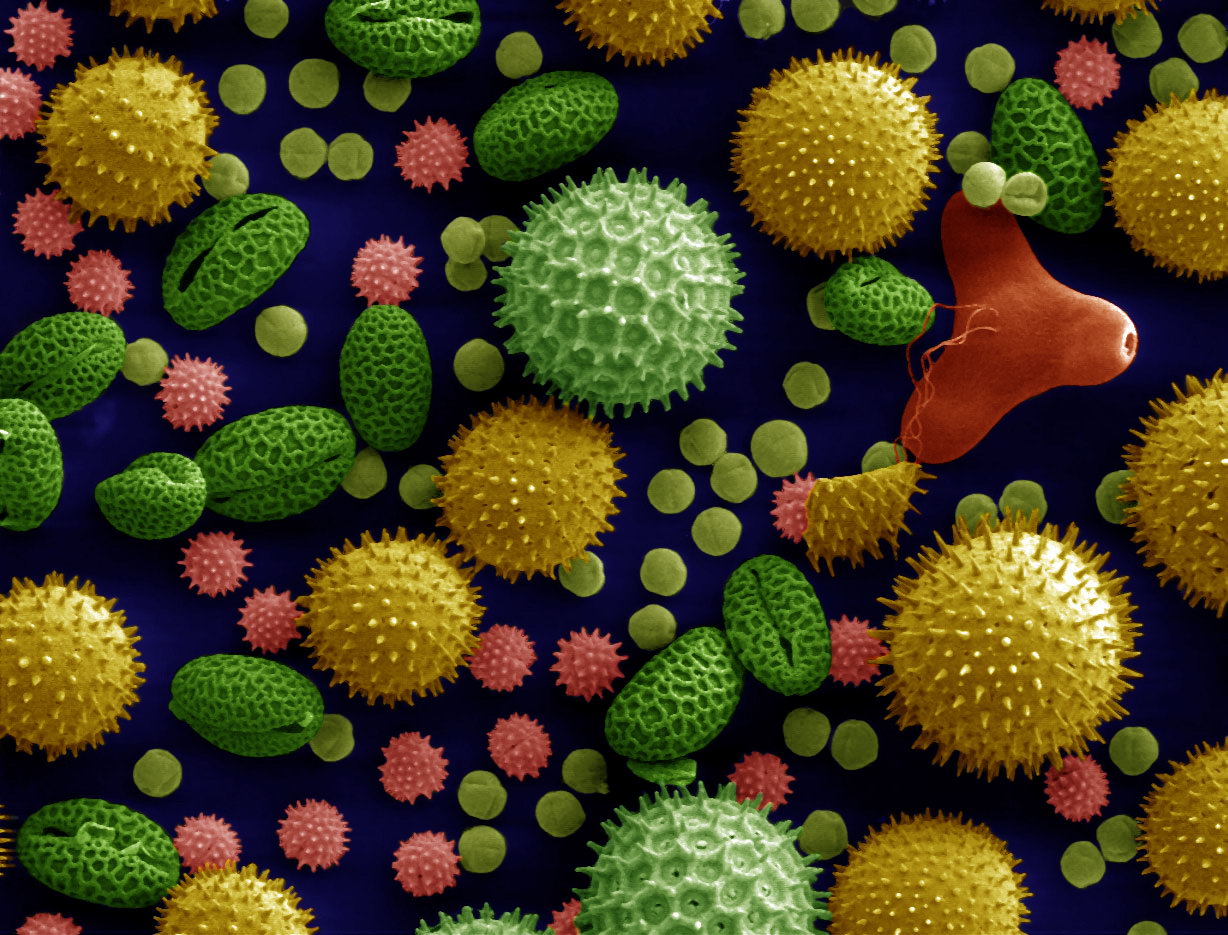
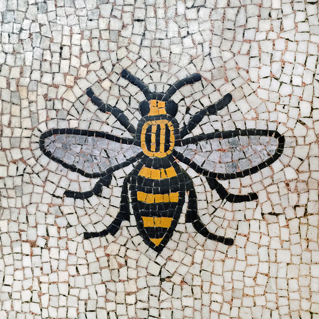
Concept: Saving The Bees.
Create a campaign that encourages pollination by a kit that provides flowers & plants specifically to help bees. It will also cover bee houses for gardens & an online campaign/application to encourage saving the bees e.g. sugar water when a bee is dying.

Question 1: would you be interested in this campaign?

Question 2: what do you think the target audience would be?

Question 3: How could I develop the campaign further?

Question 4: I would go for quite a modernist aesthetic for the adult side, and illustrated for the childrens side, do you think this is relevant, or should I stick to one design for all?


Question 1 Answers:
- Yes, it's a lovely idea!
- Yes definitely.
- Yes
- Yes, if it was easy to access.

Question 2 Answers:
- Probably older, as that age group are more into gardening and would be more suitable to the campaign
- Older age group - more into gardening
- Olden generation/family homes etc (this might encourage more children to take an interest in the subject too)
- Older generation. Parents to teach younger kids.

Question 3:
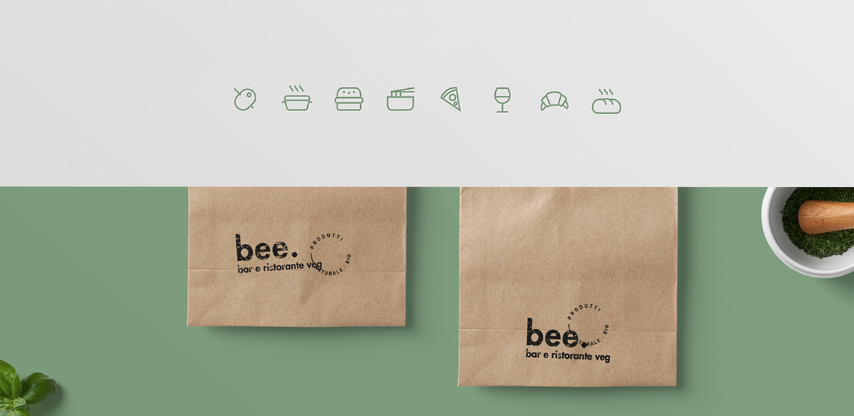
- Create a range of products and packaging. Products to help with the gardening. Shovel, seeds, watering can etc. Also booklets on saving the bees and what you can do to help.
- All of the above ^ and possibly something for younger people to get involved and help.
- Advertisements. Packaging.

Question 4:
- Keep it fun as more people would be engaged, use a lot of colour to reflect the flowers and the bees.
- Yes, keep it bright & fun, attracting a wide audience and making the products look appealing in environment.
- Yes, sounds like an appropriate design treatment.


Comments: Research into current 'save the bees' campaigns & consider if they would make you want to get involved, help this way you will be able to consider your aesthetic to attract a larger audience.
Areas of Improvement: Look into advertising as well as the products themselves.
Areas of development: Look into various aesthetic styles depending on your age range.


Areas of improvement: You're already providing flowers and plants, so develop this by creating packaging for kits for this campaign, gardening tools. Research gardening kits.
Areas of development: Information booklets. Also, people set up their own bee farms. Could you do something relevant to this to support your campaign?


Comments: I would definitely be interested in this campaign, it's a real cause & I love bees! I think the target audience could be quite broad as it could be something done as part of primary schools or olden groups that have an interest in gardening, and then there is students that are all eco friendly would probably be interested. 
Areas of development: I think you could take it further will some fun adverts/packaging.


Comments: Maybe find out why people haven't/wouldn't act on saving the bees as there has already been some campaigning for this.
Areas of improvement: Show why bees are worth saving as much as possible.
Areas of development: Consider where this would be distributed? supermarkets? online? will it be expensive? if so, would people buy it?

OUGD503 Collaborative Practice, Desperados - Evaluation (Studio Brief Two)

This brief was surprisingly challenging. The first part of this competition was to choose who we wanted to collaborate with. This was quite difficult as I don't know many people from animation or illustration, However the tasks set really helped me with this. I chose to work with an animator and an illustrator. I thought that both of the specialisms would be very helpful with this process as I'm not particularly talented with illustration or animation. I think covering all three specialisms available in this project has definitely benefited our our creative outcome.

A strength of this project was our time management, as we all worked very well together and apart. I made myself a timescale in which to have the work done. This was actually made very difficult to stick to, as I was heavily relying on the other contributors of this group. I believe another strength of this project to be my own personal research, as I found it really helped me when creating my own designs, for example, looking into websites that are out there in current day.

A weakness of this project was the fact that we were all on different specialisms. This made it very difficult to meet up as our timetables are very different. I think completing this project would've been a lot easier if we were on the same timetable, as we would've had designated time for completing this brief together instead of apart.


Overall, I think this project went really smoothly. We all had our work completed for the final deadline and the work across each platform is consistent and to a high standard. If I were to participate in this brief again, I would start working on it earlier and set strict timetables in which to meet up, as we met up very little and generally just discussed our process and current projects over social media. This was helpful however, but it could’ve helped to discuss the work in person and brainstorm further ideas.

OUGD505 Product Range Distribution - Research, Products Available (Studio Brief Two)

Before I come up with a proper concept, I think it will be beneficial to look at products that already exist for the Save The Bees campaign. This is quite a difficult task, as there are so many different websites, however most often tend to just ask for donations - although often it isn't made very clear what the donations would go towards, whether it's further campaigning or creating safe environmental places for the bees.

This is a t-shirt I found online at JCrew, which is a t-shirt created to raise awareness of the Save The Bees campaign. The t-shirt is beautifully illustrated and fits really well with the current campaign, however the t-shirt is very expensive, as it is priced at £45. 50% of the sales goes to the campaign, however this is very expensive for a t-shirt, and the company is still taking profit from the t-shirts.


https://www.jcrew.com/uk/womens_category/Tshirtsandtanktops/shortsleevetshirts/PRDOVR~F3909/F3909.jsp?color_name=Ivory&srcCode=GGBS00003_99104355717GB_209335624_17161600744_77447180768_c_pla&sisearchengine=197&siproduct=F3909&noPopUp=true&source=googlePLA&gclid=CIKXlPGS2swCFSco0wodkFsGdQ&gclsrc=aw.ds

Another product I found available online was from Friends of Earth, and is a Bee Saver Kit. It's a really awesome idea, in fact it was an idea I had myself. In the kit, you get seeds to plant the flowers that bees thrive off and create a lot of honey from. You also receive a garden planner and a Bee ID card, which shows which bees are visiting your garden. This concept is really good, however it is clear that the kit is aimed at the younger generation, and I don't particularly think it should be limited to that. It is also very expensive for what you receive in the kit, which is something that could definitely put people off - for example, it put me off. 


https://www.foe.co.uk/page/get-your-bee-saver-kit

OUGD505 Product Range Distribution - Area Chosen & Why (Studio Brief Two)

Originally, I was leaning toward doing my project about Anxiety and mental illness as a whole, however last minute in the group critique, I decided that Saving the Bees is a campaign that is much closer to my heart, and is an issue that is very real and happening in current day.

I think it's also the issue that I could have the most fun with design-wise, as it could go a lot of different ways, for example very illustrated or very minimal, whereas a campaign about anxiety would have to have a very serious tone, as it is a very real issue and impacts millions of people.

I am going to wait for my group critique to get some proper feedback on the idea before developing this further and coming up with a concept.

OUGD503 Individual Practice, Brompton Bikes - Creating the Background (Studio Brief One)

The next stage of this was to create the background and foreground. I had already cut out the buildings, however I needed to create a pavement and bike path for the bike to go along. I decided to do this, as it meant that the foreground would also be interesting to look at, but also because the pavement would give a little stand for the bike to lean up against, meaning it will hopefully be easier to film. 

Of course, these were also going to be made out of paper. i started by cutting out grass that would run along the back of the pavement. I created this under the impression that it would break up where the buildings met the pavement, and therefore cover any parts that didn't quite meet up properly (as I didn't use a ruler, I thought this would be probable). 

This is the pavement once I had stuck it down to the background. This was a very tricky process, as I had to make sure the buildings would fit in. I also didn't have any mount board big enough, so I had to use two. This made it even more difficult as the pavement had to meet up on both boards. Again, it was a very time consuming process, as I had to measure the pavement perfectly and cut it perfectly in order for all aspects to line up well. I also had to make sure the grass would fit perfectly with the size of the pavement. Overall, I think it was very successful, and surprisingly sturdy, meaning my bike would definitely lean against it propped up. 


I then created the bike path. Most bike paths in Leeds aren't marked with a specific colour like other places that I have visited, however I really wanted it to stand out as a bike path, so I took inspiration from other cities when designing this. I cut out long strips of red paper. Again, these had to be measured perfectly in order to line up with each board. I also cut out little arrows to go with it along side the pavement, showing road safety. 


Below are the final background boards once finished with the cut out buildings. They are really interesting to look at as they're colourful and engaging, and a lot of the buildings are definitely recognisable. The bright colours also really make my bike stand out as I predicted.