For this project, we have to concept of "100" and we have to produce a body of work that investigates this concept by collecting, recording, documenting and categorising. The final product of this research should be a two minute presentation in any form you want, whether it be a video, performance, song etc.
I need to identify a specific content in relation to my theme, that will become my focus of the brief. I must collect 20 facts, 20 opinions, 20 words, 20 statistics and 20 photographs.
Sunday 7 December 2014
Thursday 4 December 2014
OUGD405 Final Images (Studio Brief One)
These are the final images that I have created to be used as backing paper, based on the dreams. I think my images are really effective as they look exactly how I had hoped, and aim to tell a very short story within the frames.
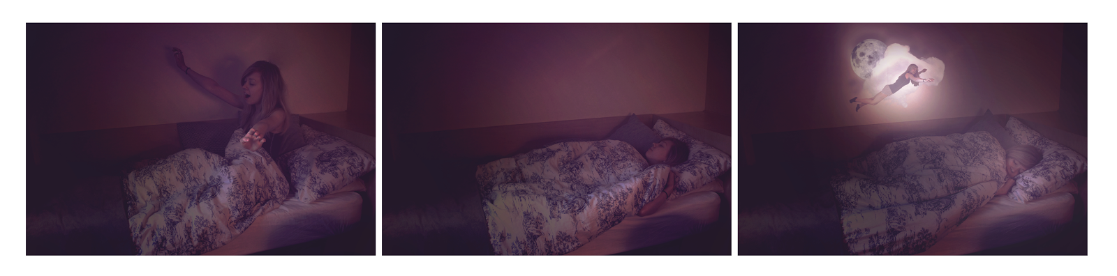
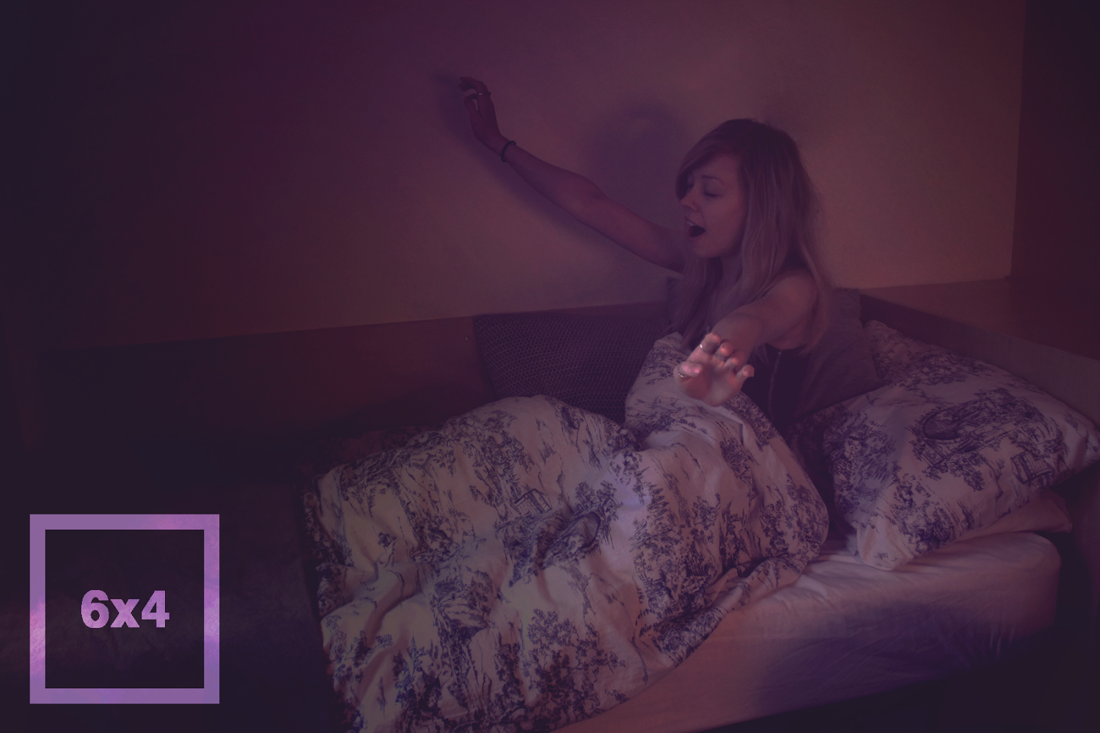


To complete these frames, I am now going to add the sizes of the frames and some information about the frame. Below are my final images. I am actually really proud of these as I think they really work as a short series of images, and I love the fact that they tell a story, even if the story is pretty basic.
To make them feel like complete backing paper, I am now going to edit them into some frames so I can get an idea of what they would look like. I think they're really successful and look well suited in the frame. I imagined them in a black frame, however, so I am going to try find one online.
I found this frame online, and I think I think it is a lot more successful as the colours of the frame really work with the darkness of the images and doesn't distract the eye. I also think it's successful as it's easier to follow the sequence of the images and you can tell that they are a set as they all have the same colour scheme and concept.
OUGD405 Development, Photoshop
To begin my backing paper, I had to decide which images I would like to use. I decided I would use the three below, as I thought they were very focused images, and as a series they definitely tell a story.


To begin the process, i knew I had to get rid of certain things that i couldn't physically move out of my shot, for example the light and the plug sockets. I am going to show every layer that I edited using a video, however only show the video of the final image, as this was the most complex image to edit as there was an awful lot of layers.
OUGD405 Research, Beyond God and the Devil (Studio Brief One)
I was looking through the new issue of Vice magazine in my spare time and I came across a short story written by Barry Gifford. The story caught my eye as the illustrations for it are absolutely beautiful, almost real life looking paintings. This particular painting caught my eye as the colours used were absolutely beautiful. I found the image online, however, and it turned out that the colours used were actually only visible in the magazine. This is the image i found online, contrasted with a photo of the magazine page that I took.


I found the colours really inspiring, and I have decided that I want to edit my photos for my backing paper with the same kind of colour scheme, and really try to enhance the purples, pinks and oranges.
Monday 1 December 2014
OUGD405 Development (Studio Brief One)
I decided that instead of taking photos around Leeds, I would create fine art photographs based on dreams. To do this, I set up a camera in my room and made my friend Hayley pose for photographs, positioned by myself. These are some of the original shots. I think the shoot really worked well and I got the shots that I wanted.


I then began the editing process. I really wanted my photographs to tell a story. I want my frame to be three that are attached, so they can tell a very slight story. I decided it would be good to keep my idea quite simple, hence the photographs of my friend lying on the chair - the plan is to photoshop out the chair and to show her dream in the final image.
Saturday 29 November 2014
OUGD405 Research (Studio Brief One)
I decided I was going to base my backing paper on dreams. To get an idea of the dreams that people have, I asked my flatmates what the weirdest dream they ever had was. These are below.
"I was on a caravan park, I knew it was a caravan park, however there was only one caravan that was very derelict and decayed. The whole ground was covered in holes, about the size of bowling balls and I had to tread really carefully to avoid getting my leg stuck. For some reason I knew I had to get to the lonesome caravan. I got to the door and knocked and stepped back as the caravan door opened outwards. The door swung open and there stood bugs bunny, however he was rabid and terrifying. He said that he needs to rip out my heart to bury it in the ground, unless I take a bag full of hearts and dry them out in the back of my car. The next thing I remember is driving down the road with the back shelf of the car completely full of human hearts. Then I wake up. It's a recurring dream that I've had since I was six years old and I have no idea what it means." - Hayley
"I was with my dad and it was back when he used to smoke, and he was smoking and accidentally burnt a bit of his face. A couple of days later he took me to some kind of floating cabin on the water in Jamaica and we went inside and in the lighting in the cabin, you could see that the burn on his face had gone white and his eyes had turned red, and he was trying to kill me with a knife. He was trying to kill me and I was shouting 'please don't kill me, dad!' and then I woke up. The dream also happened another time with another person that I knew who smoked." - Chay
"I had a dream that I worked in a corner shop and then the shop turned into a department store and I was chatting to a complaining customer and my supervisor started crying and he was like a small child. Another time I dreamt I was in the TV show crystal maze, which was pretty cool. And another time I had a dream I was being attacked by an eagle, and it wasn't just an eagle it was like a heron sized eagle, but for some reason I wasn't running away from it." - Florence
Thursday 27 November 2014
OUGD405 Photoshop Induction (Studio Brief One)
For my photoshop induction, I was asked to create a poster for a film of my choice. I decided that I would create a poster based on Avatar as it's a really good movie and I thought it would be really fun to test myself and see if I could edit someone into an Avatar character. I asked my friend to take a photograph of himself and to send it to me. This was the image that he sent me.


I then basically just played with the settings, contrast, colours and opacities. This was the final outcome, that I'm really happy with. As I have quite a lot of experience with Photoshop, I really wanted to push myself and do a really good job, and I'm really happy with the outcome as it looks very similar to the original.
OUGD405 Development (Studio Brief One)
I decided that my theme would be memories, as that is what photoframes are generally for. However, I decided i would base my backing paper on my own personal memories. To do this, I looked through some of my photos that I have taken through-out visits to different places and locations. These are some of the images that I found. The first is an image that I took in Warrington of a fly on a flower. It's really simplisic however I think the image would look really successful in a frame.


The next was also taken in Warrington. I personally prefer this one, as I think the position of the text works a lot better and the colours really compliment each other.
This was taken in Warrington town. I think it's good as the black and white image would look really good in a frame. The colour didn't show up too well so I decided I would add a low opacity circle as it made the type stand out a little more.
This was also taken in town and I think it works really well. I think it's strange that the image is of a carpark, however it still seems quite professional and the colours work really well.
This image was taken in London on Brick Lane. I think it's quite an effective design, however it is a bit boring to look at.
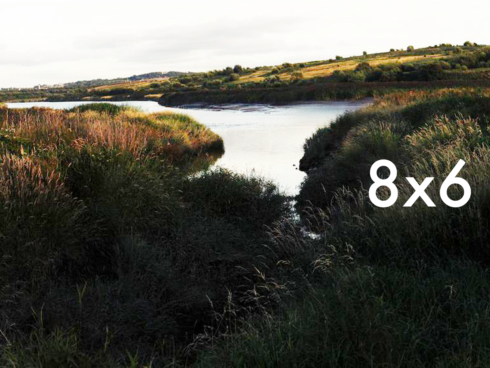
I then decided to change the way I would display the size of the frames. This can be seen below. I looked through some of my photographs on Flickr that can be found HERE. I then added different sizes to the photograph. I think these designs looked a lot slicker, so I figured this is the style of design I will go for once I have taken some photographs for this project, and not ones I have already taken.
I inverted the type and shape on the images, so that you could see it on whatever image I would put it on and I think it was really effective and looked slick.
I then played with the shape that the type was inside, and also the position of the type and shape. These can be seen below. I think the square definitely works, but so does the circle - however the circle only looks good in the centre of the image, and depending on what the images I take look like, this could be an issue if I don't use the rule of thirds.
OUGD405 Idea Generation (Studio Brief One)
I am unsure whether to create illustrative designs or use photography. For this reason, I think I will explore both and see which outcomes I prefer most. I am going to go take some photographs on the weekend of the city and then decide which I am going to take forward and develop further. As I already have quite a few images that I have taken myself of the countryside from when I have been at home, I am going to begin experimenting using them, until I get a solid idea.
Once I have created these, it will probably be nearer the weekend and I will then design some illustrations, as I think the ones that Urban Outfitters sell would work really well if they were with a simpler frame, and I really like the idea of using a pattern.
Once I have created these, it will probably be nearer the weekend and I will then design some illustrations, as I think the ones that Urban Outfitters sell would work really well if they were with a simpler frame, and I really like the idea of using a pattern.
OUGD405 Design Process, Frames (Studio Brief One)
For this brief, we have been asked to create 3 images that would fit in a photoframe as the photo that the frames would be bought with. The brief requires us to reimagine the backing images, however each image must include the dimensions of the frame. The concept of the design should be shape, however we should be creative with our manipulations and compositions. The designs must be part of a set or series.
I am going to go to a couple of shops over the weekend and do some research into backing paper that already exists. In the meantime, however, I am going to look into backing paper online, as I would like to atleast get an idea of the backgrounds I would like to create after doing some primary research in store.
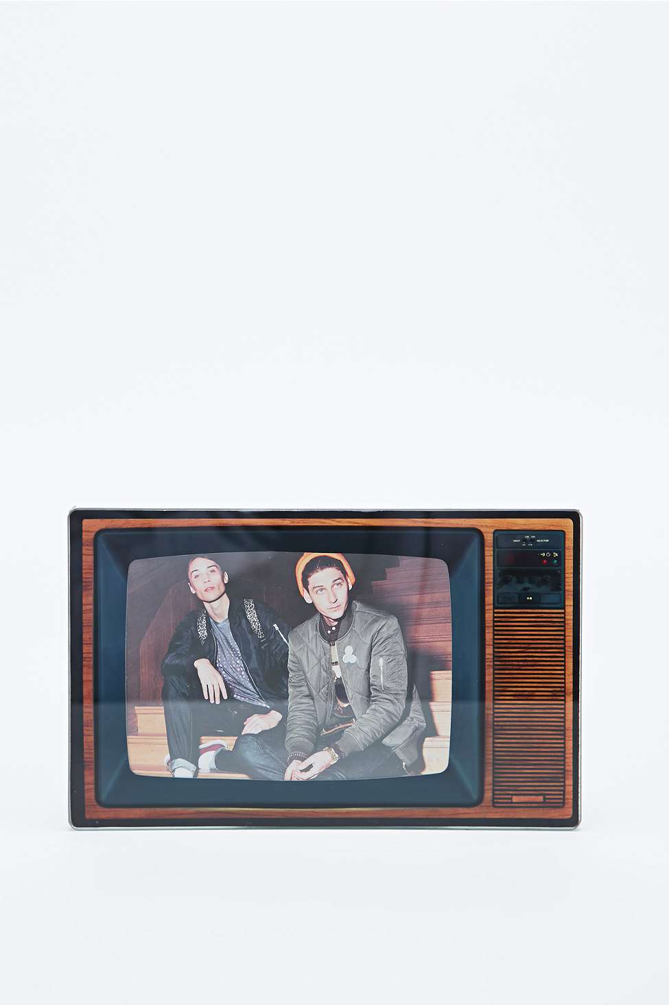
To begin with, I have googled backing paper frames. Not a lot of images came up in the search, so I decided I would look at online stores and the photoframes that they offer. I firstly started by looking on Urban Outfitters. I think the image and the frame below really compliment each other, as the colours and image style really match with the tv style, however it could've worked even better if the image was in black and white and was quite grainy.
I am going to go to a couple of shops over the weekend and do some research into backing paper that already exists. In the meantime, however, I am going to look into backing paper online, as I would like to atleast get an idea of the backgrounds I would like to create after doing some primary research in store.
To begin with, I have googled backing paper frames. Not a lot of images came up in the search, so I decided I would look at online stores and the photoframes that they offer. I firstly started by looking on Urban Outfitters. I think the image and the frame below really compliment each other, as the colours and image style really match with the tv style, however it could've worked even better if the image was in black and white and was quite grainy.
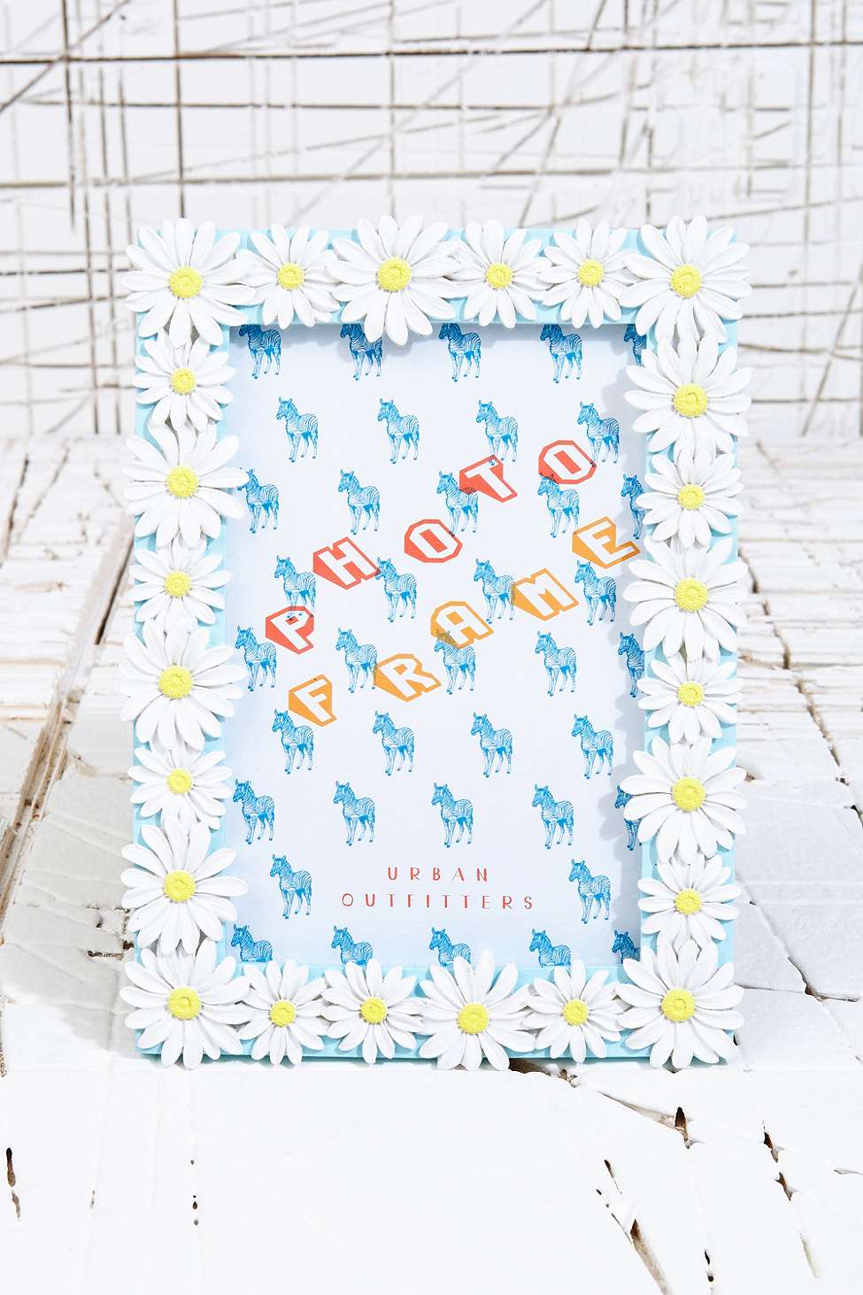
Personally, I don't think the backing image in the frame below works too well as the image and the frame don't relate too well, as the image is illustrations of horses and the frame is created out of a daisy change pattern. I think the image would've worked a lot better if it was in black and white and the type was in colour, as I think there is a little too much going on and it's quite harsh to look at.
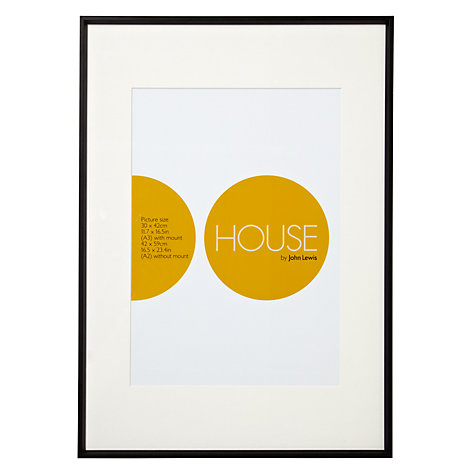
I then decided that I would look online at photoframes from Marks and Spencers, however the photoframes on there didn't have any images in them. Personally, I think these actually look a lot better displayed like this, as they are simple and you seem to get a better look at the frame, as the eye isn't distracted by the image. I then decided I would look at John Lewis. I think this design is really great as it's incredibly simplistic and modern. I think the typography used really works as well, as the 'O' matches the circle theme.
I think this design is a little too simplistic and I don't personally enjoy the colour scheme used, however it does fit with the frame, as it doesn't distract from the design of the frame.
I will create a new post on the weekend once I have gone to the shop to look at some designs in store, as I don't think I can get the true effect of the image online.
Tuesday 18 November 2014
OUGD404 Icons, Symbols and Logos
We were given a talk from John about icons and symbols and we were split into groups and asked to redesign the fire exit sign, that is world known and incredibly recognisable. My group began by deciding which colour we would want our sign to be. We think that the dark green colour that is used is very ugly and we wanted our sign to be aesthetically pleasing, so we decided to change the colour to a turquoise/teal kind of colour. We decided this as the colour red means danger, however the fire exit shows safety, so therefore it is the opposite. We started thinking about the conotations behind the colour blue, and it generally means cold or cool. I think that is the perfect message for a fire exit, as it'd be away from the heat.
This is our final design for our exit sign. I think it's really successful as the colours are really striking against each other, however I don't think it'd work in anywhere other than English speaking countries, as it wouldn't be worth risking people not understanding where the fire exit was. This is generally why symbols are used, because of language barriers.

This is our final design for our exit sign. I think it's really successful as the colours are really striking against each other, however I don't think it'd work in anywhere other than English speaking countries, as it wouldn't be worth risking people not understanding where the fire exit was. This is generally why symbols are used, because of language barriers.
Sunday 16 November 2014
OUGD403 Evaluation
I’ve really enjoyed this module as I have learnt multiple new skills, such as Indesign, and I have also developed my skills in certain areas, such as drawing and also Illustrator. A particular brief I thoroughly enjoyed was alphabet soup as I really love thinking conceptually and I think this is a particular strength of mine. I tried to stay away from the obvious choices for the word ‘mature’, such as mature cheese, as I thought this would, excuse the pun, be really cheesy, and I wanted my typeface to be legible. For this reason I created a letterform based around development, which I think worked really successfully. I also really enjoyed the Delivery brief, in which we had to make three posters, as I enjoy poster design and this brief also allowed me to think conceptually. I was also really happy with the three final posters that I produced, as I think they work as a series even though they all have a different message.
I think through-out the module, I was really successful with time management, as I finished all of my briefs in time for each critique. A weakness of mine was definitely keeping up to date with my blog, as I didn’t at first and it took me quite a while to catch up. I plan to keep on top of it in the next module. I found this module quite challenging as there was quite a lot of information to process, however I will be more prepared next module as I have an idea of the work load now. I found it really interesting learning about artists that I hadn't heard of before, and I found the briefings really useful as Simon went into detail about some of the artists and their particular styles, such as Shepard Fairey.
Friday 14 November 2014
OUGD403 Final Crit (Studio Brief Four)
In the final crit, I presented my three final posters to the group. Overall, people said that the colour scheme definitely works, a lot better than the original red and black theme I was going to go with. They also gave me some suggestions of how to improve the posters if I had more time, for example the Type and Image poster could be edited very subtly just so it had the two planes instead of the stars, and there wasn't necessarily a need for "bullshit" within the poster, however if I did this it wouldn't be a type and image poster. They also discussed with me whether they thought the type on the bottom of the image poster was necessary, and I said that I think it was as it broke up the image and made it a poster, whereas before it looked more like an illustration. I chose to use Helvetica for each poster as it apparently doesn't give off a specific message or theme, and I think it worked for each poster as it kept a constant within the series. Overall, I am really happy with my posters and the development behind them, as you can almost see my thought process as I was trying to think very conceptually.
Thursday 13 November 2014
OUGD403 Poster Development, Image Only (Studio Brief Four)
For the final poster, I had originally started trying to design posters based on the conspiracy theory, however I was really struggling as the posters really lacked typography and explanation - the message wasn't too easy to understand and they weren't aesthetically pleasing. This is one of the posters that I originally designed. I think the message is clear, however there was far too much negative space to be an effective poster design, and it looked quite empty. I think the concept behind the poster was really successful though.


This was an idea that I had that was based on the government not being involved in the disaster, however more on the rememberance. I think this poster could definitely work, however it is very simplistic and after research, I have found out that it has been done quite a few times before.

This is my next poster design, based again on remembering the disaster. I think this design is very slick, simplistic and successful, so will be my final idea. However, the message of the poster isn't too clear, so I am going to add some very small type at the bottom for a website that can be found HERE. I think this will be okay as it just gives some further information about the meaning of the poster.

This is my final design with the type added. I think it definitely needed it, and it also makes it look more like a poster than the previous. I think it's good as it links to a website that is all about remembering those who lost their life in the disaster, instead of being just an illustration.

OUGD403 Poster Development, Type and Image (Studio Brief Four)
For this poster, I knew I was going to stick with the same colour scheme as the previous poster, as the link between them all would be more apparent. This was one of the posters that I designed, based on remembering The Twin Towers and how they are a very important piece of history that should never be forgotten. This specific poster was based on the against side, where the people don't believe in the governments involvement in the disaster, and care more about remembering the people who lost their lives. I think this poster could have been effective, however posters like this already exist and look better than my design, as they aren't limited to 2 colours.


This is another poster that I designed. I think this poster works really well, and is also for the same reason as the above. I think the simplicity of the poster works really well and is very relevant to the message of the poster. Again, however, it is quite simple.

Instead, I decided for the type and image poster, I would use the message that the government were behind the collapse of the Twin Towers, as I thought I would really struggle to create a poster based on this without using both type and image. I think this poster is really good as it sticks to the colour scheme and works really well. I thought the message could be a little clearer, so I changed 2 of the stars in the flag to planes and made it really subtley look like they were flying into the Twin Towers - something you would only really notice if you studied the poster closely, as I didn't want to offend people viewing the poster too much.

As this didn't really look like a final poster, I decided I would add a website to the bottom as it would look more like a finished outcome. This is the final poster design, which I'm really happy with.

OUGD403 Poster Development, Type Only (Studio Brief Four)
I decided I would jump right into using Illustrator to create my posters, as I thought this way I would be able to create better quality, and slick posters. This was the first poster that I designed, which was based on being open-minded about who was behind the 9/11 disaster. I think it works, however it is incredibly simplistic and I think too simplistic. I changed the U so that it would look slightly like The Twin Towers, however I don't think it works too well as the message isn't too clear.


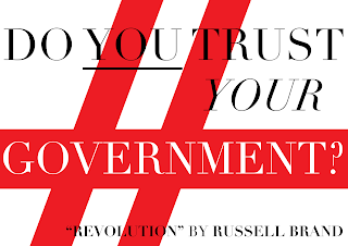


I then designed this poster, that was supposed to have the same message. I think this works quite well, as it isn't about trusting the government, just about having your own opinion and doing research on them opinions. I think this was a lot more successful as the message was a lot clearer and the poster also had a reason - which was to buy Russell Brand's new book "Revolution".

I thought it might be effective if I added a quote from Russell Brand himself. I got this quite from the interview on Newsnight. I think this poster could definitely work, however right now seems a little basic - however I think it is definitely high impact and makes you question your opinions and loyalties.

As this poster was working, I decided I would add a reason for the poster, which was again to buy Russell Brand's "Revolution" book. I also added two strokes of red across the poster, as I thought this would represent the falling of the Twin Towers and show the reason why he made the point about trusting the government and the media. I think this definitely works, and it also looks vaguely like the English flag, which shows that you should not only question the American government, but your own government.

I then looked into the quote from Russell Brand a bit more, and decided I would focus more on The Twin Towers and the reason he made the point. I thought the vague illustration of the twin towers worked well for the previous poster, so I decided (as this is a type only poster) I would edit a letter in the quote to look like the Twin Towers. I think this was definitely my most successful poster as the message of the poster is very clear.

To make this part of a series, I decided it would be most effective if all my posters followed the same colour scheme. So for this reason, I changed the colours of the previous poster colours to the colours of the American Flag, which again will just make the message of the poster even more obvious. I think this was really successful and I am proud of the way it has turned out.

OUGD403 Research, Sedki Alimam (Studio Brief Four)
Sedki Alimam is a graphic designer based in Uppsala in Sweden. I think his work is incredibly interesting as he uses very basic and limited colouring, something I have looked into a bit as I am limited to using 2 colours for my own poster designs. I particularly like his illustrations entitled "Bic Man" which can all be seen HERE. He has created multiple characters based around the Bic logo on his favourite pop culture characters. I particularly like the design below, which is based on the character Heisenberg from the series Breaking Bad. I think the limited use of colour really works for his poster designs, as they are aesthetically pleasing and simplistic, however you can still recognise a lot of the characters that he has tried to recreate in the limits of the Bic logo.


I also really like his work entitled 'Dissociative Identity Disorder'. He describes it as "A mental disorder on the dissociative spectrum characterized by at least two distinct and relatively enduring identities or dissociated personality states that alternately control an animation character's behaviour" which basically means it is based on a cartoon character whos actions are controlled by another. The series can be seen HERE. I think the concept is really interesting, as it's true that the character couldn't develop without the other, and infact both characters wouldn't really exist or have a purpose without the other. For example, in this particular cartoon, the Roadrunner wouldn't torment the Coyote, and Wile E. Coyote wouldn't have much of a purpose as a character without the Roadrunner. They both shadow each other, however both compliment each other at the same time. I particularly like this design as the Alimam has screen printed the designs onto t-shirts and jumpers.

OUGD403 Research, Cranio Design (Studio Brief Four)
I had an idea of creating a poster about how the government were behind the 9/11 attacks. My idea is that I will use George W. Bush's eye, and then have the reflection of the Twin Towers within the pupil. As I don't want the eye to be life-like, I decided I would look at artists that use very minimal colours and create illustrations of eyes. Izzie told me about the artist on Behance called "Craniodsgn", who has a series of images that were exactly how I wanted my illustration to look. The website can be seen HERE with the whole series on.
I particularly liked the illustration below as the expression is incredibly explicit and is a similar style to the type of eye I would like to illustrate for my poster. I think the textures and simplistic shading really works for this illustration as it is incredibly slick.
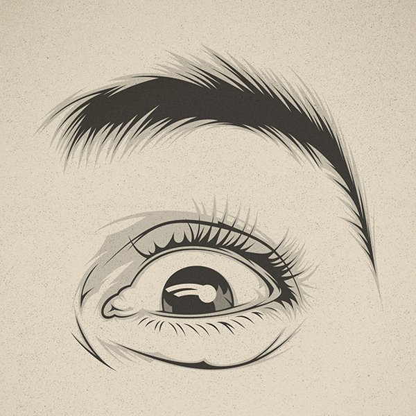

I particularly liked the illustration below as the expression is incredibly explicit and is a similar style to the type of eye I would like to illustrate for my poster. I think the textures and simplistic shading really works for this illustration as it is incredibly slick.
I think this kind of expression would also look really successful for my poster as it gives off the feel of mischief, guilt and cunning.
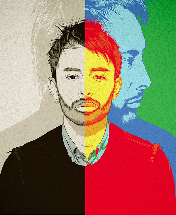
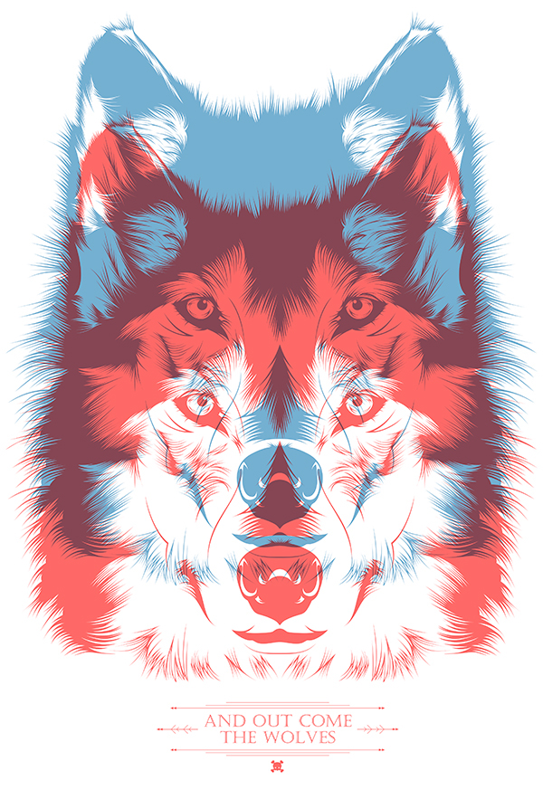
Cranio is a vector illustrator and graphic designer from Valencia, who works as a freelance artist. He has worked for many big clients, such as Warner Bros and Nike. His other illustrations are incredibly clean and slick, and I think they're really effective as they generally use around 2-3 colours (which is perfect inspiration for the poster I plan on designing). Some of his illustrations are quite psychadelic, such as his design of Thom Yorke from Radiohead, and a t-shirt designed entitled "Out Come The Wolves".
Subscribe to:
Posts (Atom)