Thursday 19 February 2015

OUGD406 Book Cover Typographic Treatment, Study Task Three (Studio Brief Two)

For study task three, we were asked to use the information that we received from studio brief two and create further analysis and idea generation for our own book designs. Firstly, we were asked to turn the negative words that we had received into positives. My responses are below.

Boring/Dull/Tedious  >  Simplistic
Contradicting  >  Approved
Ironic  >  Sincere
Dark  >  Light
Misrepresentation  >  Relevant
Gothic  >  Apparent
Slapdash  >  Careful

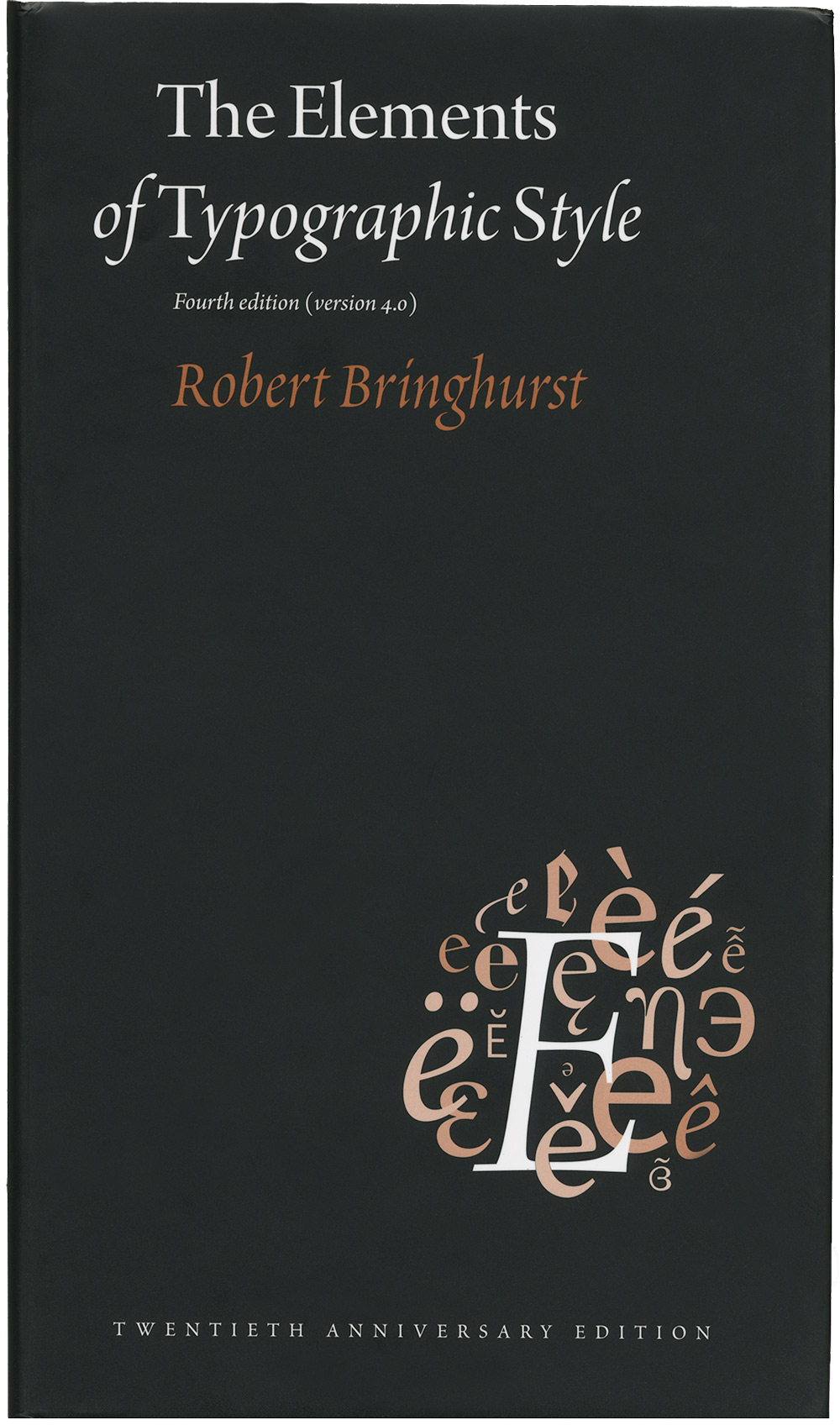
We were then asked to take these positives and find a typeface that could be relevant and relate. From the word 'simplistic', I knew that I wanted to use a sans serif typeface as personally I feel that serif's sometimes complicate and I don't want my book design to do this. The word 'approved' made me think of Vignelli, who said you only really need to use around 6 basic typefaces through-out your whole career as a designer. These typefaces are Helvetica, Futura, Bodoni, Garamond, Times Roman and Century Expanded. As I didn't want to use a serif type, I knew it was a choice between Helvetica and Futura. I decided to use Helvetica as it's an incredibly simplistic, neat typeface and I think it will really work for the aesthetic of my book design. I think it could also be considered as a 'relevant', 'apparent', 'careful' and 'sincere' typeface, so I think it's a successful type choice to improve on the original book design's typeface.

I then looked into what I wanted to stand out on my book design. I decided that the title should be the most important information on the book cover, so I think this will be first and it should be quite a big size. I then wanted to add the title 'the typographer's bible', even though this wasn't actually featured on the original cover design. This will be second, however it will be in quite a small font. I then thought the author is important as well, so this will go next. It will be in a bigger size than the sub-heading, however it will be further down the design.

I then created how I would picture the type for one of my designs. This is below. I thought, as the books content is quite modern, I would focus on what modernism consists of. I used Helvetica and Left-alligned text, as this is one of the keys of the modernist theory. I also made sure that there was a lot of negative space, as this is key for modernism also.


The next part of this task was to go around every persons design in the class and leave a small comment/word of the feel that we gained from their designs. My comments are listed below. 

  • Simple
  • Conveying a message (all caps)
  • Straight forward
  • Sensibly elegant
  • Ordered
  • Modernism
  • Minimal
  • Good amount of white space
  • The type sizes are all slightly different, but are very simple and effective

I found this task really useful as I now have an idea of how to lay out my type and also know which typeface that I would like to have on my front cover. I was also struggling for ideas for my book design, however I think the subverted words will make my responses really focused which I think will help me with idea generation.

Monday 16 February 2015

OUGD406 Book Cover Analysis, Study Task Two (Studio Brief Two)

1. Who designed the cover? Are there any links between them and the book?

It was designed by the author of the book, Robert Bringhurst, so yes, there are links between the book and the cover.

2. What is the intended message?

The intended message of the book design is to give a taster of what you will learn if you read the book - for example, the cover shows the letterform 'E' in different typefaces and some letterforms have accents - things that are dicussed through-out the book.

3. What are the semiotics behind this message and how/why have they been used to support the message/content?

The front cover shows a plain black background with a group of letterforms in the lower right-hand corner. The letterfors are in a gradient ranging from orange to white. The letters are all the letterform 'E' which I believe refers to the word 'Elements' in the title of the book. They are all in different typefaces, which I think is because Bringhurst discussed the displayed typefaces in his book. The letters also have accents on which Bringhurst also discusses in his book.

4. Is the cover successful in communicating this message/content?

I think this cover is successful in communicating the message as it's simple and to the point. It isn't over-complicated. The circle of type also could be based on a brain - which is relevant as it's considered 'The Typographer's Bible' and it's an informative book.

5. Are there any counter-arguments, if so how could this be better communicated?

Although successful, it's not a very aesthetically pleasing cover design to look at. It doesn't jump out at you and it's very simplistic. This could be communicated better if the brain of letterts was central instead of the post-modernesque feel that the book is going for at the moment.

We were then put into groups and asked to respond to each persons book covers with a sentence of analytical feedback and then sum up the cover with one word. My groups responses to my book cover are below:


  • The cover has a postmodern feel and doesn't really fit with the content.
  • The type used reminds me of the Bible, which is relevant as it's referred to as 'the typographer's bible'.
  • I don't think it works at all.
  • The illustrated type looks like it was stuck on afterwards - like it was an afterthought to fill the empty space.
  • The cover doesn't exactly shout that it's about typography as the type used is a bit of a mess - it's ironic, really.
  • It shouldn't look like a book that you don't want to read, and right now it does.
  • The word 'of' doesn't fit with the title - it looks like they accidentally forgot it and added it afterwards.
  • The colour scheme is quite successful as it reminds me of pen and paper, however I think the use of the colour red is pretty weird and irrelevant.
I then asked my group to give me a single word to describe the book cover. Most of these were pretty negative, which I thought would be useful to me as I will have to try to stop these negatives in my own design.

  • Boring
  • Dull
  • Tedious
  • Contradicting
  • Ironic
  • Dark
  • Misrepresentation
  • Gothic
  • Slapdash
I found this groupwork really useful as I now know what I have to avoid to make my own design successful. It was also useful to get an idea of what everyone else's covers are like and what the book designs that are already on the market look like and why they are successful or unsuccessful.


Sunday 15 February 2015

OUGD406 Book Analysis, Study Task One (Studio Brief Two)

To prepare for Studio Brief Two, we were given the opportunity to pick out a piece of paper from a box, and on that piece of paper was a book title and information about where we can find that said book in the college library. My book can be seen below.


I found this book in the library, however I decided it would be useful to look around at the books that it has been placed with. Generally, it was placed in the same category as typography. 

1. Who is the theorist/author/editor/publisher?

The author and theorist is Robert Bringhurst, who is a Canadian poet, typographer and author. He has also written 'A Short History of the Printed Word' fulled revised and updated with Warren Chappell. 


The publisher of this book is Hartley and Marks. They have also published other books, such as 'A Short History of the Printed Word', 'Finer Points in the Spacing and Arrangement of Type' and 'Letterletter'


2. What is the purpose/concept?

The purpose of the book is to inform about typography. Hermann Zapf called it 'the typographers' bible'. It's a typography style guide, and also a history of typographic usage & a brief encyclopedia of typographic concepts, resources and traditions.

3. What is the context?


The context of the book is generally summing up the history of type and it also discusses how to use typography successfully. 

4. What is the classification?

The classification of the book is typography/theory/historical and factual.

I believe the book to be aimed at students and also graphic designers and typographers in the industry, as it is well known for being 'the typographers bible', which insinuates the fact that the book can be used and referred to at any age. I think the book is, however, written quite complex so may be aimed at university students rather than college students studying typography or design.


OUGD406 Entries & Submission (Studio Brief One)

I decided I would get rid of the typography on one of my designs as it looked like the title of the album cover and I didn't want that. I think this is just as successful, even more so as it is left up to the interpretation of the viewer. I submitted this design to the Secret 7 website. I have also decided that I am going to submit the one based on Apple as well, as I think it's conceptually strong and makes the viewer think.


OUGD406 Final 5 Designs and Final Crit (Studio Brief One)

Below are the final designs that I came up with, and I am happy with each and every one of them. I changed my whole approach since the interim crit as I wasn't too happy with the designs as they felt very simple and didn't match the song that I was trying to respond to too well. All of the designs below are in response to the song Digital Witness by St. Vincent.

The design below is based on the idea that technology consumes us, based on the lyric 'people turn the TV on, it looks just like a window'. I took this photograph by putting my camera on self-timer, and wearing all black, including putting a pair of tights on my head so that I was completely faceless. I think put the tv on a plain white, and used this as my complete lightsource. I think the design is really effective as all you can see are my hands and it kind of questions what technology is doing to us, it's almost robotic, which was inspired by the movement of people in the music video.


This design is based on the lyric 'I want all of your mind' and is incredibly simple, yet I believe the concept to be strong. It is based on the company apple who use the exact same style of branding to sell their products. You can tell it's based on this by the use of the lowercase 'i'. I think this is one of my strongest designs.


The design below is based on the coding of technology and also how we are being brainwashed and addicted to technology. I used the lyric 'confession' as I want it to be obvious that the technology companies should confess to the corruption and lack of privacy that people now have, as they are dependent on technology in day to day life. I used abstract colours to echo the colours used in the music video, and it also makes it abstract which I think its successful.


This design is also based on the lyric 'confession' and it has the same concept, however I changed the pixel distortion to the word instead of the background. I think this is also successful as it has the same message as the previous design. 


The final design is based on the idea of insomnia, based on the lyric 'I stopped sleeping'. I used black and white to echo the idea of being very awake in darkness, which is what insomnia is really. I am, however, unsure if I should use the lyric on the album design or not, as I think it is successful with both.


In the group crit, we were only allowed to show 2 final designs, so I decided I would show the two below. We had a similar style of group crit to the interim crit, however we worked in pairs and wrote in a lot more detail which I thought would be a lot more helpful in refining the final designs.


The sheet below was written by Charlotte & Drew, and they were critting the colourful 'confession' album. Their assessment was really helpful, especially the part where they told me to redo the curning of the type, as I was unsure about this myself.


This particular sheet didn't leave a name who critted it, however I didn't find the information they had written very helpful as they suggested I try a different font for the 'iWantallofyourmind', however the font was chosen very specifically as it is the type that apple uses for their adverts - Myriad Pro.


The next crit was written by Liam and Lo, and they said that the word 'confession' could insinuate that it's the title of the song, which I also agree with so might get rid of the type completely.


The final sheet was written by Becky and Chris, and they said that the iPhone inspired design was very successful, powerful yet simple. 


I found this crit really useful as we weren't there to see what people have written or to explain the concept, the pair had to work out what the concept was from the design, which will be the same when Secret 7 assess the work. I think my strongest concept was definitely the design based on Apple.

We were then asked to create a small summary of the artwork that we have created in 140 characters as that's the limit we have to submit when we actually submit to Secret 7. To do this, I used Twitter as the limit for a tweet is also 140 characters. 

For the design 'confession', I summarised it like so:


For the design 'iWantallofyourmind', I summarised it like so:


OUGD406 Interim Crit (Studio Brief One)

For this group crit, we had to lay out the designs that we had come up with so far and write out five questions that we wanted people to answer about them. Then the class went around and answered each question for the questions posed.


Question 1: Which song do you think these responses are for?
ANSWERS: 
  • The Chemical Brothers - Let Forever Be, because there's lots of links to the music video.
  • St. Vincent - Digital Witness, because of the consistent link to technology.
  • Underworld or The Chemical Brothers, because it looks almsot digital and looks almost like it's been distorted.
  • The Chemical Brothers, because the clock reminds me of the video.

I found these responses really interesting as they were all for the song Digital Witness by St. Vincent, which made me think some of the designs could be classed as unsuccessful, or could also be classed as successful as it's supposed to be quite tricky to figure out which song the vinyl design is for.

Question 2: Is the design of the clock obvious that it is based on insomnia?
ANSWERS:
  • Not obvious that it's based on insomnia, but I think this design makes it more obvious that it's about The Chemical Brothers.
  • No, it just reminds me of The Chemical Brothers music video.
  • It's not obvious but I don't think it has to be. It's subtle, in a good way.
  • I think 2 and 4 are definitely obvious.
  • I don't think it's obvious, however I don't think it looks like an album cover as much as the rest.
I found these responses quite interesting as personally I thought it was quite obvious that it was based on insomnia, however these responses helped me as I think I want my work to be a little more obvious.

Question 3: Do you think number 3 would work as an album cover?
ANSWERS:
  • Yes, I really like this concept I feel this is the strongest.
  • Yes, really like this one, but perhaps a different image. Maybe a busy street, which may link back to the street drummer in the video.
  • Yes, not your average album cover so it stands out.
  • Without knowledge to the song, I cannot say for sure - however a city scape would allow more idea variation and more to play with.
  • Yes! It's different and unique. I think the landscape image in the square looks good though.
  • The only thing I don't particularly like is the actual landscape - it looks very ordinary (unless this was intended?)
These responses helped me as I wasn't sure whether to use this concept. However, I don't think I like this concept myself and for that reason I won't take it forward.

Question 4: Should number 5 be a photograph or illustration?
ANSWERS:
  • An illustration - this would look better, more unique and original, as a photo feels commonly placed and slightly resembles a textbook.
  • I think the photo works well, however you could try editing the image so the colours are slightly more vibrant. You could also try doing an illustration and see yourself which works better.
  • I think it works as a photo. If you had enough time I think exploring illustration version would be worth it. I like the hand crafted look that illustrations can sometimes bring. It can be made more cute + personal. It depends if it would still reflect the song or not.
  • I think you should leave it as a photo as there's more detail which is really intriguing.
  • Possibly just a black and white illustration could work.
  • I like it as a photo as it captures how intricate it is. It would take a long time to replicate this into an illustration.
  • I think it'd be nice to see it a an illustration so you can compare.
These responses were useful. Personally looking at it after it has been critted, I think the album art would be unsuccessful, however if I have time I may try to recreate it into an illustration.

Question 5: Is number 4 too simple? Should the colours be edited to be similar to the music video?
ANSWERS:
  • I think it looks good. It's bright and bold making it stand out. However, out of these 5 this is my least favourite. The others have more to them which I personally like better.
  • I like the concept behind this one and I think it works well even though it's so simple. The colours stand out and you can tell what it is.
  • I like how you've used to colours from the video, however the design is my least favourite as it's obvious which sats its about.
  • Not too simple. The colours are bright & stand out.
  • Keep it the same. I find this interesting as it's not the main focus of the music video.
I found these responses really helpful as some people said stick with it and some people said it's too simple - something I was a little worried about, as it is quite an obvious response.

I think I won't stick with any of these designs and I will try to make my ideas more obvious, however less simplistic so that no one will be able to recreate them/have already created them.

OUGD406 Thumbnails (Studio Brief One)

I decided that I would start by drawing out some initial ideas influenced by the songs. As I couldn't decide on a song, I drew out a couple of design ideas for The Maccabees, St. Vincent and Underworld. These are below.


As I had the most thumbnail ideas for St. Vincent, I have decided that I will focus my vinyl designs on this as I think I will be able to experiment a lot more and I think the colours used in the video are really nice.

OUGD406 Album Artwork Research (Studio Brief One)

Before I start designing my vinyl covers, I want to research into successful album covers that already exist and maybe think about why they are successful. The album design below is for the album 'Abbey Road' by The Beatles and was designed by Kosh/Iain MacMillan. It's incredibly effective as it symbolises the band as a whole, for example John Lennon is wearing a fully white suit and Paul McCartney is wearing no shoes. The design is considered to be incredibly British. I think it's really effective as this particular zebra crossing in London is now a type of landmark, and many tourists go there and try to take photos on the crossing in a similar style - which I'm sure would be very annoying for drivers as there will constantly be people crossing the road. There is also a website of a livecam set up of the road where you can watch people constantly crossing the road and taking pictures, which I think is really cool. The website can be found HERE.
This album cover is for the artist Bjork for the album Homogenic and was designed by Alexander McQueen. Bjork is well known for pushing the boundries for her music and has also been well known for her approach to album artwork. McQueen went with the image of Bjork being a "warrior of love". The hair alone weighed 10 kilos. 
This is the album art for the album Nevermind the Bollocks by the Sex Pistols. It was designed by Jamie Reed. It is said that Reed had no interest of putting the band on the cover as "the band were ugly anyway". He used ransom-note styled lettering, incredibly striking colours and simplicity that anyone could recreate, which was perfect for the genre of the album - the DIY Punk aesthetic.
This album is for the band Pink Floyd's album called Wish You Were Here and was designed by Storm Thorgerson. Thorgerson based his design on the idea of absence, with the album shrink-wrapped in a dark colour to hide the artwork. The gesture of a handshake between the two men was inspired by Welcome to the Machine and Have a Cigar, and by the idea of people that hide their true feelings for fear of 'getting burned'.
This is the album artwork for the band Justice for the album entitled †. Justice are one of the coolest French duo's since Daft Punk. The album cover was designed by Surface2Air. Their adoption of the cross as their symbol was appropriate, given the quasi-religious following they obtained and built through the underground. The colour scheme referenced T-rex's Electric Warrior.
This was the album cover designed by Robert Fisher for the album Nevermind by Nirvana. It's an iconic image of an innocent baby swimming toward a dollar bill. Kurt Cobain apparently concieved the idea after watching a TV show about water births. The meaning of the album cover has never been released and never will be, however I imagine it to be about the corruption of the government and how we are brought up from as soon as we are born to be reliant on money.
This album cover was designed by Andy Warhol for the band The Velvet Underground. Early copies of the sleeve had the invitation to "Peel slowly and see, enabling the owner to peel back the banana skin to reveal a flesh-coloured banana underneath. The album artwork would've been successful for whichever band it was designed for, as Andy Warhol's artwork is iconic and always will be.
This cover was designed by John Squire for the band The Stone Roses. Squire was higely influenced by abstract expressionist painter Jackson Pollock. The piece referred to the May 1968 Parisian Riots - hence the coloured daubings of the French tricolore on the left. The lemons pointed to the fact that they could be used as an antidote to tear gas. 


OUGD406 Peter Saville Research (Studio Brief One)

Simon told us about a graphic designer that is incredibly famous that is invited by Secret 7 every year to submit artwork. His name is Peter Saville and he is well known for his sleeve designs for incredibly successful artists, such as Joy Division. This design is incredibly successful and was probably the first album design of its time not to feature the artists name on the sleeve. It's incredibly successful, however simple as he literally just inverted an image that Joy Division gave him.


I found this interview that Simon told us about incredibly interesting as he took his design inspiration from things around him, which means all of his designs are not only successful for the bands, but also very personal to him. The interview can be viewed HERE.

OUGD406 Research of Social Networking (Studio Brief One)

Before I started designing my own responses to a particular song, I wanted to look into the designs that people had already done for the competition. To do this, I took to social networking as some people post their designs online once they have been submitted. There weren't many that had been posted online and I think that this is due to people wanting to keep their designs secret until the competition entry date is over, as they don't want people to get ideas from their own designs. However, I did manage to find a couple.

I found this design on Tumblr. I think this design is really simplistic however it's really effective as I think the texture used works really effectively over the hexagons. I think this design is for the artist St. Vincent - Digital Witness, as the music video uses a similar colour scheme and is very geometric and modern, similar to this particular sleeve.


I also found these responses all by the same designer. I think these particular responses are for the song Sledgehammer by Peter Gabriel, as they are incredibly abstract and this is echoed in the music video. It could also be for The Chemical Brothers, as the video is also very abstract and almost trippy.


Finally, I found this design. I think this particular design is for The Chemical Brothers - Let Forever Be, as the music video features girls dancing around and I think this looks very similar, however I am unsure as the colour scheme is incredibly different. I think it's a successful design either way, as the illustrations are really nice and it is definitely kept secret which song the art is responding to.


I found looking through art that is in this years competition really helpful, as it gave me an idea of which artist to focus my own designs on and also the styles in which some people are using.

OUGD406 Synesthesia (Studio Brief One)

To get us in the right mindset to respond visually to music, we used synesthesia. I knew what this was as I did a similar task in Art Foundation. It's basically using one of the five senses to influence another sense. So in this instance, we were using hearing to influence touch.

To begin this task, we listened to each song fully and also watched the music videos if the song had a video. The first response was to The Maccabees - Go. We were asked to draw lines, dots, triangles and circles. I think it was really interesting to do this kind of design for this song as it was quite relevant as I believe the song to be about nature and the geometric shapes worked pretty well. We passed the sheet around the class 4 times, each time someone new would have to draw something and add to the artwork.


We then listened to Peter Gabriel - Sledgehammer. For this, we were asked to draw objects and imagery that we heard in the song. Also, Simon was making the music quieter and louder in certain parts, and we had to respond to the change of volume with our drawings. This made for quite an interesting piece of artwork, as people responded very differently on my sheet of paper.


We then responded to The Chemical Brothers - Let Forever Be. For this particular album cover design, we were asked to draw objects that we saw in the music video, mainly trying to draw without looking at the paper and just focusing on the music video. I think this response worked really well as the space of the vinyl design was used really effectively by everyone that drew on my sheet of paper. I particularly liked all the abstract shapes and the use of different colours of weights of the pens used.


For the next vinyl design, we had to respond to St. Vincent - Digital Witness. We were told not to use any ink, however to use the pens we had to make indents in the paper and create interesting shapes. The next person was then asked to fold the sheet of paper to the music. I think this created really interesting shapes and indents in the paper which could be useful when designing my own vinyl.


We then responded to The Supremes - Reflections. We were asked to use typography to express the feelings of the song. For this, myself and the people who wrote on my sheet of paper wrote out particular words that stuck out to them in the song. I think it was really effective as the space was utilised really successfully - although I would have to be less obvious if I actually used this idea for a development, as the rules state that you aren't allowed to use the title of the song.


The next song that we responded to was Underworld - Born Slippy (NUXX). In pairs, one person had to hold a pen very still and the other person moved the paper underneath the pen. This was interesting as the person with the paper had all the control. It was quite a tricky task, however I think it was very successful as the song is all about addiction to alcohol and I think the very rough lines represent the feeling of being drunk. 


We then listened to The Rolling Stones - Dead Flowers. For this image, we had to draw using a continuous line. I don't particularly like my response for this vinyl cover, however I liked the shapes and patterns that other people responded to.


We then stuck all of our responses on the wall in the studio which I found really useful as I got to see how everyone else had responded to the music and they were very varied.


I found this exercise incredibly useful as it made me think a lot about thinking visually and how I would go about creating my vinyl designs. It was also interesting to look at everyones responses, as a lot of them were incredibly different for each song, which I thought was really interesting as we were all listening to the same song.

Thursday 12 February 2015

OUGD404 Book Content Ideas (Studio Brief Two)

To begin my idea generation, I am going to look into things that interest me and hopefully base my book content on one of them. To start the process, I am going to create a mindmap of some things that could be relevant for my book.


I thought about doing a book about skate as I have quite a few friends that skate and I really enjoy the fashion. I have previously made a video advertising Carhartt based on skate and I think it could work really well as a publication. This is the video that I created.


I also have considered creating a book based on movies. I think this could be quite interesting if I reviewed films that are relevant to typesetting. For example, I could review the movie 'Orphan' to display my knowledge of orphans in type.

I also had a look at some websites that I browse regularly, for example The Daily Street. I think this would be really interesting to create a book for as I find the content really interesting, and it would also be helpful as I wouldn't have to create my own content, I could just typeset it in my book. I think this is the idea that I want to go forward with. I think I will create an annual book of the 10 most successful blogposts. As The Daily Street is based on The Daily News, I think it would be interesting to create my book in a similar style as the newspaper, however not stick to it too closely, for example I won't use as many columns, however I will consider using a similar stock to newspapers.

OUGD404 Orphans, Widows & Rivers, Study Task Three (Studio Brief Two)

When designing our own books for this brief, we are going to need to show our knowledge of typesetting. To do this, we will have to avoid orphans, widows and rivers which are all considered bad things. An orphan is when you have one word on a line on its own at the end of a paragraph. These are easily gotten rid of by editing the tracking on lines and moving words down until it adds others to the bottom line.


A widow is when you have one line at the end of a paragraph on its own in a seperate column, which can be seen above. You can get rid of these by splitting up paragraphs, reducing the leading and widening columns.


Rivers are gaps left in between words that flow through your column. They're common in justified type and can easily be got rid of by flushing your type to the left or to the right. You still see these in flushed type sometimes but these can be got rid of by editing the tracking.

OUGD404 Typesetting, Study Task Three (Studio Brief Two)

We were given the task to descramble the poem 'A Mouse's Tale' from the book Alice in Wonderland and told to typeset it using both modern and postmodern principles. We began by sketching out how we wanted to design our modernist page. We settled on a two column grid because we thought it would be the most pleasing to the eye as there would be a lot of negative space around the bodytext. We also decided to use Helvetica as it's a very slick, modern typeface. We also decided we would keep the type left-alligned and make the rag as neat as possible.


This is our final typeset. When we presented it, people said that they thought it was really effective but if they were to change one thing they would change the bold on the Authors name. I agree with this as it is a little harsh on the eyes. We found it really tricky as a group for the poem to work effectively and also have a neat rag but I feel like we did really well in the end.


Then for our postmodern design, we decided to not use a grid and have the type in a kind of mouse's tail style. Apparently this is what the original book is like, however it is set out differently. We got this idea from the title of the story 'A Mouse's Tale'. We chose to use the typeface Garamond as it's not a very modern typeface, however it is a classic - similar to the book.