This outcome was a lot more successful than the previous idea of scribbling by hand, however it still wasn't really the outcome I had pictured in my mind.
Tuesday 29 December 2015
OUGD504 Further Development (Studio Brief Four)
As my last attempt as making a scribble was unsuccessful, I decided I would try another approach. From a previous project last year, I was aware that I can film my screen. I figured this would look a lot less pixelated and maybe even be more relevant, as I wouldn't have a distracting hand in the way of the scribbles, and also the album artwork is actually vectored, so it may be more relevant.
OUGD503 Individual Practice, Eurojust - Feedback (Studio Brief One)
I have an idea of which logo design I would like to use for this brief, however I would like to get some feedback of which design I should take further and develop. As I am currently in Warrington for Christmas, I am going to ask for some feedback from some people who I did an art foundation year at college with - as they have an understanding of graphic design also.
Dan (illustrator) agreed that the best design as it is simple and he said he doesn't think a logo should be over complicated.
Stephen (photographer) said that the Euro design is nice, but it doesn't really portray what the company is about. He said he prefers the final design, and I should try to incorporate a concept into that.
Ollie (graphic designer) said he preferred the last design as it's minimal and legible.
Molly (illustrator) agreed with Ollie and said the last design is the most successful and she thinks it'll be the design that works the most successfully in colour.
After receiving this feedback, I am now going to try the design in colour, and maybe experiment further with it.
OUGD504 Initial Idea (Studio Brief Four)
I decided to focus on the idea of building up the website using scribbles. I thought the easiest way I could achieve this would be to film myself scribbling onto a page. As I didn't have to correct coloured felt tip to make up the background, I used the colour black, as I thought it would be the easiest to edit into a different colour. Below are some of the outcomes that I came up with.
However, it was a lot harder to get the scribbles to the correct colour than I thought it was going to be, as I didn't think about the fact that my hand would also change colour in the process. This is what the concept looked like after editing. It was unsuccessful as, the video looked very pixelated after this process and also it just didn't look as slick as I was hoping it would.
OUGD504 Parallax Studio (Studio Brief Four)
Based in Leeds and London.
Founded 5 years ago.
Work with NHS, Dyson, Microsoft, Xbox, Amaazon web services.
Louis - head of design.
Lawrence - director and founder.
How the agency works.
Everything revolves around the client.
Clients deal with account/project manager, they deal with heads of department or head of design
10 tips for designing
1. Wireframing (prototypes)
2. Responsive design
3. Fonts/Typefaces - Adobe Typekit, Fonts.com
4. Organisation
5. Research/Inspiration
6. Retina/High DPI
7. Interactivity
8. Understanding
9. Consistency
10. Compromise
info@parall.ax
OUGD504 Introduction into User Experience (Studio Brief Four)
What is user experience?
The overall experience of a person using a product, for example an app, in terms of how easy & pleasing it is to use.
Where has UX come from? A brief history.
So, What us UX?
What is a 'user' anyway?
The overall experience of a person using a product, for example an app, in terms of how easy & pleasing it is to use.
Where has UX come from? A brief history.
- Leonardo Da Vinci's Kitchen nightmare (circa 1430)
- Taylorism & Fordism (early 1900s)
- Toyota - humanising systems (1948)
- Dreyfuss' Designing for people (1955)
- Disney and the role of joy (1966)
- PARC & the design of personal computers (1970s)
- Don Normal: The First UX Professional (1995)
- The iPhone (2007)
So, What us UX?
- Research and testing
- Behavioural psychology
- Date analysis
- Persona development
- Product design
- Requirement gathering
- Information architecture
- Nomenclature
- Copy writing
- Tone of voice
- Problem exploration
- Solution discovery
- Prototyping
- Interaction design
- Interface design
- responsive
- Performance
- Visual Design
- Brand
- Marketing and comms
- Customer service
- Design culture
What is a 'user' anyway?
- Consumers
- Customers
- Audience
- Person
- Human
Online is no longer a destination.
- On and offline experiences are increasingly converging.
- The rise of digital native.
- Good user experience is a baseline - what else?
How to include audience?
Step 1: Identify your users.
Step 2: Challenge assumptions.
Step 3: Include your users.
Name: Alba
Demographic Information:
Age: 19
From: Manchester, UK
Marital Status: Single
Family Arrangement: Student, living away from home
Job: Art Student & part time bar staff
Behaviours:
Creative, Social drinker, smoker, very specific music taste, social media user.
Needs & Goals:
Connection with artist, local gigs (small venues), competitions, affordable merch.

Name: Connor
Demographic Information:
Age: 21
From: Sheffield, UK
Marital Status: Single
Family Arrangement: Student, living away from home
Job: Maths Student, part-time retail assistant
Behaviours:
Musical, creative, intimate gigs, open music taste, 'indie'.
Needs & Goals:
Cheaper merch for subscribers/discounts in general, connection to music artist, into competitions for fans.

OUGD504 Research (Studio Brief Four)
Before I start designing my wireframes, I'm going to look into some websites that already exist for some music artists and get some inspiration. I wasn't too sure where to start with this, so I decided to look on Spotify at the artists that are similar / related to Grimes. The artists that came up were: Purity Ring, Austra, Zola Jesus, Active Child, Glasser, Washed Out and How To Dress Well.


Purity Ring:

Purity Ring is a Canadian electronic music duo formed in 2010 and originally from Edmonton, Alberta. The website is successful in a sense, as it uses imagery as the menu options, so therefore it isn't limited to fans in just English-speaking countries, however you physically have to click each link to know which page you are going to be on. It would be more effective if when you hover over the link, it would change to a certain word. The website has the options to change the language on each page, so it would be more effective if the menu bar was just words as it would be a lot easier to navigate.
Zola Jesus:

Zola Jesus is an American singer-songwriter and record producer. Her website is successful as it's striking and abstract to observe and the typeface works really well against the photograph. It's an easy website to navigate and gives multiple different easy-access links to social media and ways to listen to more music.
Active Child:

Active Child is the working name of electronic music artist Pat Grossi. The website is easy to navigate, however I'm personally not too keen on the kerning of artists name, however I assume it is related to their album cover for their latest release. The background of the page is their latest music video and the page also plays music, which I think is both a good and bad thing - it's good as the user can listen to the music very easily, however most people who are going to be visited the website will already be listening to music as it is uncommon to sit in silence when surfing on the internet.
Glasser:

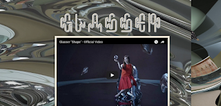
Glasser is an American singer-songwriter and record producer signed to True Panther Sounds. Their website is, in my opinion, unsuccessful as it's very trippy and quite difficult to look at for a long period of time as the gif in the background is quite distracting. The colours also don't work too successfully with the items that have been blogged onto the website.
How To Dress Well:

How to Dress Well is the stage name of American singer-songwriter Tom Krell. Their website is easy to navigate and the background imagery is used effectively. The website is successful as it's easy to sign up to their mailing list and the scrolling is simplistic and the website is legible.
Monday 28 December 2015
OUGD504 Idea Generation (Studio Brief Four)

In this mind map, I explored multiple ways in which this website could be given a relevant concept. I began by analysing the Art Angels album artwork - this involved noting that the artwork uses hand-drawn typography, it's in an anime kind of style, it uses mainly primary colours, and it is space-themed. I then analysed what I know about Grimes, and came up with a couple of concepts. The first concept was that the website could be based on the latest single 'Flesh Without Blood', as the music video is very extravagant and set in current day, however with olden-styled outfits. Another concept was to focus on the lyrics of another latest single, which is called 'Scream' - however this would be quite a difficult thing to do as all of the lyrics are in a different language. The final concept I came up with was to focus on the whole drawing aspect of the artwork, as Grimes creates all her own album artwork. I thought of different ways that I could explore this, such as filming the creation of the album artwork, making it interactive somehow or possibly building up the artwork in a quicker way, such as using scribbles.
Sunday 27 December 2015
OUGD503 Individual Practice, Eurojust - Mock Up Designs (Studio Brief One)
I decided to move onto Illustrator and start making some black and white mock ups of some logo designs. Most of these don't include the European flag, as I figured if the actual concept of the design was there, I would then further develop the logo to fit the requirements. This logo idea was a development from one of my rough sketches. It simply has changed the E in Eurojust to the Euro currency symbol. I think this is actually really successful as it's simple and legible. I used the typeface Futura for all of my logo designs - this was because, after some research, it is a typeface that can be used by companies as long as the type can not be changed - meaning that I would have to expand all of the type in Illustrator and then it is free to be used anywhere.

I then experimented with the magnifying glass idea. I think that this particular design was too much with the lines in, and therefore decided to get rid of the glass-look inside the 'O' which can be seen below.

I think this was more successful than the previous design as all of the strokes are the same thickness and therefore it would make it easier to rescale the logo design without losing quality and detail. The only problem I had with this particular design was the fact that the 'O' looked a little bit like the letter 'Q'.

I changed the direction of the stroke of the magnifying glass and this is what it looked like. This is definitely the most successful out of the three designs as the O no longer looks like the letterform Q and it's also a very minimal logo design - something that I think Eurojust should work with for their logo design, as their current design is very complex and all over the place.

I then decided to experiment further with the handcuff idea. This was to symbolise the idea of fighting for justice. The design below wasn't too successful as the design for the handcuffs didn't really look like handcuffs like I had imagined.

This is an experiment with the letterform O. I tried to make this look like handcuffs, but as expected it looks more like the letter G than it does handcuffs.

I then went for another obvious response to the competition. I turn the O into a fingerprint - also symbolising the fight for justice. I think the design is quite successful, however it couldn't be rescaled by much as it would lose too much detail, and therefore that makes it unsucessful.

I tried to experiment with this idea further, by getting rid of some of the detail of the finger print. This is unsuccessful as it no longer looks like a fingerprint, and I'd say it more looks like a target.

Finally, I decided to go back to the idea of just using type. I think this logo design isn't great as it is spread out too much and it isn't too obvious that the use of the stars from the European flag is the letterform 'O'.

In this design, I tried to make this factor more obvious. I think this design is the most successful, as it's very minimal and slick, but it also meets the requirements of the competition brief.

Thursday 24 December 2015
OUGD504 Research into Artist Chosen (Studio Brief Four)
The decision between which band has been quite difficult, however I have decided to try and create a website for the music artist Grimes, as I'm really into her music at the minute and I find her artwork very inspiring. I think, as she creates all of her own album artwork, I will try to emphasise this on her website.
Grimes real name is Claire Elise Boucher, born March 17th 1988, and is a Canadian songwriter, singer, music video director and record producer. She first became involved with the underground music scene and began recording her own experimental music while attending McGill University in Montreal. Grimes' music has been noted by critics and journalists for its atypical combination of vocal elements, as well as a wide array of influences, such as electronica, pop, hip hop and R&B.
Grimes real name is Claire Elise Boucher, born March 17th 1988, and is a Canadian songwriter, singer, music video director and record producer. She first became involved with the underground music scene and began recording her own experimental music while attending McGill University in Montreal. Grimes' music has been noted by critics and journalists for its atypical combination of vocal elements, as well as a wide array of influences, such as electronica, pop, hip hop and R&B.
OUGD504 Possible Bands to Create Website for (Studio Brief Four)
Frightened Rabbit.
Website:
Album artwork:

At first glance, this website could definitely use a redesign, as it looks like the background is using a stock image of wood, and it doesn't fit with the texture of wood that is on the album cover. The colour scheme of the website and album artwork also don't match, and the general layout of the web page is quite hard to navigate.
Hans Zimmer.
Website:

Album artwork:

Looking at Hans Zimmer's website, you can see that it needs a complete rebrand as it looks very old. He would be quite a difficult musician to create a website for, as he is constantly getting involved in new projects and releases new music monthly, as he creates music mainly for movies and television shows. He'd be a really interesting artist to do, however his website would have to quite basic to fit with all of his new releases, meaning there isn't much point in redesigning this website as it wouldn't answer the brief that we have been set.
The Naked and Famous.
Website:

Album artwork:

Above is the website and album artwork for the artists The Naked and Famous. It's an old album that was released in 2013. I think this could be really interesting if I filmed myself ripping up a poppy so that it related to the artwork, as their current website is incredibly basic. I don't think I will create this, however, as although it is very basic and simplistic, it is quite effective.
Cry Baby Cry.

Above is the album artwork for CryBabyCry's latest EP. It is entitled 'Go Go'. This would be a really interesting band to create a website for, as they are a local band with quite a small fanbase, so the website and concept that I would later develop would help get the band some exposure and recognition. It would also be quite interesting to create a website for this band in particular, as I have filmed videos of their shows previously.

Grimes.
Website:

Album artwork:

Grimes is an artist I'm really fond of at the moment, she creates really obscure music and she then creates illustrations to go with the album. I think she's a really interesting artist and she's just released a really good album entitled "Art Angels". Her website is quite basic and hard to navigate, however it is apparent that it is a temporary website just for her latest release. I think it could definitely use some work that would make it easier to navigate and also more interactive. I also think the website shouldn't be just the album artwork, it should also advertise the other albums, as each album uses her own artwork, so the colour scheme could just be the same colours used as this album artwork, however it could relate to all her releases.
OUGD504 SONY Music / Only Studio Briefing (Studio Brief Four)
The Brief:
Today, Only Studio came into uni and gave us our next brief. The brief is to create an immersive and engaging website to support the release of your favourite band or artist's latest album. The business objective of this brief is to increase sales or presales of the album to ensure chart success. The role of the communications is to deliver a world class digital experience that gets both fans and media excited about the upcoming album release and achieve cut through in a crowded digital age. The market place objective is to get fans of your chosen artist to pre-order the album and get involved in the campaign through sharing content with their network by creating a world class digital platform that encourages fans to engage with the campaign at every available opportunity.
Things to be considered:
A global campaign - the band artist has five ket markets (Australia, USA, UK, Germany and France)
Promote activation points - promote key 'activation' points (shows, signings, appearances etc)
Use mixed media, such as image, audio and video to communicate your message.
This is a campaign website, therefore it will be live for four to six weeks ahead of the album launch and approximately four weeks afterwards.
Deliverables:
Low-fidelity wireframes in an option format design of a desktop and mobile version of your idea.
Grids download: http://bit.ly/1Qv7SEH
Wednesday 23 December 2015
OUGD504 ONLY Studio (Studio Brief Four)
ONLY Studio is a graphic design studio based in Leeds thats primary focus is web design and development. They came into uni and talked about their latest campaign for a website, which was Lost Village Festival. It looked really interesting, and they sounded really passionate about the project. They used a lot of their own handmade type to add to the aesthetic and mystery of the festival, which I thought was a really successful touch. They then set us a brief to complete within the next couple of weeks, which was to create our own website and concept to get more users on the website.
Tuesday 22 December 2015
OUGD503 Individual Practice, Eurojust - Rough Sketches
Before jumping onto the computer, I wanted to experiment with pen and paper first to get a rough idea of how my logo design could work. I originally decided to experiment with the obvious responses to the logo design - for example, changing the E in Eurojust into the symbol for a euro. This could, in a sense, be successful, however it’s an incredibly obvious response to the task and it’ll be beneficial to experiment further with this.

I then had another idea; this was to change the O in Eurojust into a magnifying glass. This would symbolise the purpose of Eurojust; as Eurojust is a company that works across Europe to fight organised crime - I thought this would be quite relevant as it’s a kind of cartoon idea of how people go about fighting crime - for example, Sherlock Holmes and Nancy Drew. This mock up definitely has potential and I’m going to experiment further with this on Illustrator. I think right now it doesn’t look too great, but the concept is there and it will obviously be very different in an actual typeface other than my own hand writing.

My next concept was also to go along with the fighting crime theme. I tried to turn the letterform ‘O’ into handcuffs. I don’t think it’s successful as it no longer looks like an ‘O’ and it looks more like a ‘G’. This may look very different on the computer, however, so I will still make a mock up on Illustrator.

I then experimented using the symbol used in the original logo design; the scales. This design definitely has potential, as it’s obvious that the judgers of Eurojust will approve as it will be similar to their original logo - which they were clearly fond of - but it will definitely be an improvement.

There is a requirement for the logo design to feature the stars from the European flag. For this reason, I decided to experiment with just type and the stars. All of these designs can be seen below. I decided to use the stars as the letterform ‘O’ for each design. I think the first and second designs are the most successful. This is because the spacing could work successfully. For example, in the second rough sketch, it has elements that are similar to the original logo design. I don’t think that the third sketch is very successful as the design as a whole doesn’t look central.


OUGD503 Individual Practice, Eurojust - Research (Studio Brief One)
Current Logo design.
This is Eurojusts current logo design. To me, it looks very tacky and almost as if it was done on MS Paint. The typeface does fit with the illustrations, however I wouldn't particularly say that that is a good thing, as the illustrations are quite poor. The colours used do, however, work successfully together. The yellow and blue are there as they are the colours of the European flag, although I'm not sure the reason behind the red box. One of Eurojusts competition requirements is to include the European stars on the flag, meaning my own design would probably be most successful if I stick to the colours yellow and blue.

Logo design.
Before beginning my own logo design process, I thought it would be beneficial to look into logo designs that already exist for big corporations. Below is the logo design for Avivo. Avivo is an independant branding and creative technology company. Their logo design is very successful and the icon fits incredibly well with the typeface. Their colour scheme also seems to be fluent with the rest of their identity, although their website is currently under maintenance. This logo is successful as it can be used as both a text and image logo, but also just an image and it is still recognisable.


This is Eurojusts current logo design. To me, it looks very tacky and almost as if it was done on MS Paint. The typeface does fit with the illustrations, however I wouldn't particularly say that that is a good thing, as the illustrations are quite poor. The colours used do, however, work successfully together. The yellow and blue are there as they are the colours of the European flag, although I'm not sure the reason behind the red box. One of Eurojusts competition requirements is to include the European stars on the flag, meaning my own design would probably be most successful if I stick to the colours yellow and blue.
Logo design.
Before beginning my own logo design process, I thought it would be beneficial to look into logo designs that already exist for big corporations. Below is the logo design for Avivo. Avivo is an independant branding and creative technology company. Their logo design is very successful and the icon fits incredibly well with the typeface. Their colour scheme also seems to be fluent with the rest of their identity, although their website is currently under maintenance. This logo is successful as it can be used as both a text and image logo, but also just an image and it is still recognisable.
Below is the logo design for a website entitled 'Acapo', which is a business that focuses on design, trademarks and IP strategy. Their logo design is recognisable, slick and efficient. It's very memorable and works very successfully on their website. Their colour scheme is quite earthy tones, which is successful as the business they specialise in is quite a stressful environment, and therefore their logo design and website have a calming effect.

This logo design is for a company entitled 'newwave' and was designed by George Bokhua. The design is very successful as the name relates perfectly to the design - as the wave is shown between the 'w' on the word 'new' and the 'w' on the word 'wave'. This is also made apparent with the use of colour, as both letterforms are the colour blue. It's a symbolic logo design, and it's very effective - although I can't find anywhere what the logo was designed for.
I found this logo design on DesignInspiration.net. I think it's really successful as it uses the negative space in between the letterforms 'O' and 'R' to create a lightning bolt symbol. The typeface used is a sans serif and is very bold. It works very successfully with the thinner typeface used below. It works well displayed on the black background with the texture.
Tuesday 15 December 2015
OUGD503 Individual Practice, Eurojust - The Brief (Studio Brief One)
This competition brief was found by Hattie and posted onto the Graphic Design Facebook wall. I find it quite an interesting brief as it is for a huge company across Europe and it would be good exposure if my logo design were to be chosen.
The brief is around 8 pages long which is a bit unnecessary, so for this reason I am going to write a more concise brief that I myself can follow. The link to the full brief is HERE.
The brief.
Eurojust is the European Union's body for judicial cooperation against serious and organised crimes. The aim of the competition is to update the Eurojust logo, to make the body more distinguishable and recognisable to its stakeholders and the general public. The contest offers students from art, graphic design, design, and architectural establishments an opportunity to participate in a creative project that should help them continue their studies or professional careers in the fields of visual arts, design and fine arts.
The logo design should re-iterate the ethos of the company. It should feature the European flag stars, using the correct dimensions and CMYK colours. The designer will have to research whether Eurojust may use the typeface used.
what we are: the European Union’s judicial cooperation body
the problem: cross-border crime
what we do/the solution: coordination, cooperation, fighting serious organized, cross-border crime, justice, centre of expertise.
our values: the rule of law, justice; safety, security, serving Europe and the EU Member States, connecting judicial actors;
the result: less crime, safer society
List of key elements to be conveyed in a new logo: cross-border crime, coordination and cooperation between EU Member States with different legal cultures and legislation, serious organised crime and justice/judicial cooperation. (These elements are provided only as a guide to the key elements; not all are necessary elements in the development of a new logo.) In addition, the European Union flag symbol should be used according to the guidelines. See Eurojust’s website at www.eurojust.europa.eu for more inspiration.
The design proposal must utilise the word ’Eurojust’ clearly in the logo, and must also include a pictorial symbol. Participants have to use one or more of the elements mentioned above to provide a proposal that encapsulates Eurojust’s mission and role optimally.
Competition deadline: 27th January 2016
Monday 7 December 2015

Sunday 6 December 2015
OUGD503 Individual Practice, Leeds Christmas Print Fair - Evaluation (Studio Brief One)
I really enjoyed finding and executing this brief. It was really beneficial to go ahead with this particular brief as it was locally organised, which has potential to help me in the future. I particularly enjoyed the experimentation side of this brief; the screen printing. Although I have screen printed before, this was a different way of working and very rewarding. The actual print fair was very enjoyable as I was in contact with other designers and illustrators, one of which had a similar style to my own - Antony Cameron. It felt really good to be a part of the print fair, as I have expanded the people that I know within Leeds that work within the art industry.
A strength of this task was time management and planning. I only had a very short amount of time to come up with a concept and execute it. It was a lot of intense hard work to get everything finished and well presented for the print fair, but I think I did a really good job. My concept was relevant for myself at this current time; the designer I aspire to be.
A weakness of this project was probably the fact that I didn't have any display shelves, neither did I buy any for the print fair. I couldn't afford to spend money on this, and I think it was a slight let down as at first people were scared to look through my prints incase they disorganised or messed them up - however after a while people did start rummaging with my encouragement.
Overall, I'm really proud of this project, I feel as though it has been a success as I have got my name out locally and I have got a lot of business cards out into the world too. I also did also manage to sell around 3 prints. This may seem quite disheartening, however it only cost me around ten pounds to create the prints / buy the ink / buy the stock, and therefore it was successful as I sold my prints for five pounds each.
Saturday 5 December 2015
OUGD503 Individual Practice, Leeds Christmas Print Fair - The Day (Studio Brief One)
This is the poster that we were sent and told to put on Instagram. It is pretty interesting as it lists all of our names and is therefore exposure in itself.

These are my prints on sale at the print fair. I tried to lay them out so that people passing by knew that they were all different designs, which I think was successful as through-out the night many people looked through them.


Exhibit Leeds posted a photo of our table on their Instagram account also, which I thought was really nice as they tagged us all and therefore we got some exposure locally.

And heres a photo of myself and Florence selling our prints.

We didn't manage to sell many prints as most people went for brownies (rookie mistake), however multiple people did pick up my business card which I think is really great as it's some exposure to my own design practice, which is useful as I want to stay in Leeds when I graduate.
Monday 30 November 2015
OUGD503 Individual Practice, Leeds Christmas Print Fair - Final Prints (Studio Brief One)
To begin with, I started experimenting with different types of stock. I bought all of these from the library as I didn't want to go to Fred Aldous and spend a lot of money on stock when I might not even sell any prints. All of the coloured stock I bought is 125gsm, except for the water coloured stock, which didn't pick up the ink very well due to the texture. I think the coloured stock is really successful and the mixture of different colours works really well and makes both the paper and the design pop.


I have now also printed all of the designs onto a plain white stock. I think this made the colours of the inks stand out a lot more than the coloured stock. I'm really proud of all of my prints, and I think it's really interesting that each design is very different from each other.

To finish this project, I now need to print out some business cards in digital print and then go sell some prints at the fair!
Subscribe to:
Posts (Atom)