Friday 29 April 2016

OUGD505 Product Range Distribution - Intern Magazine Workshop (Studio Brief Two)

Concept: The concept of this publication would be discussing peoples issues based around feminism and intertwining themes, supported further by wider current affairs.
Audience: 20-40 male or female.
Aesthetic: Colour scheme is black and white, however it will be added to depending on the imagery on the front cover or that specific page.
Strategy: Arch
Lifespan: It will keep going until it is not needed anymore, 4 issues per year - 1 every 3 months.

Within our group, we decided to each design a front cover for the magazine, and then got back together to choose the best one. My wasn't chosen, but I have attached the image below, along with a double page spread that I created.


These are the front covers that were chosen.


Below is the presentation that we presented to the class.

Thursday 28 April 2016

OUGD505 Product Range Distribution - Study Task 04 (Studio Brief Two)

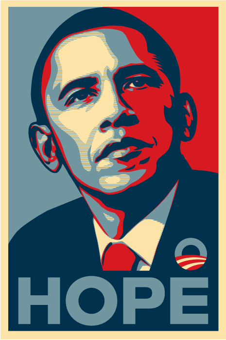
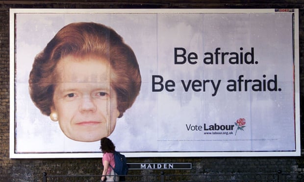
For this study task, we were asked to get into groups of three and produce a campaign to encourage more people to vote. Florence, Izzie and myself all have similar political views, this view being that we really dislike the Tories. We looked into different campaigns for other political parties which can be seen below.


As a group, we came up with the idea to play with words and integrate them into the surroundings of Leeds. The rough ideas can be seen below.


We then started designing. We gave Izzie the job of creating the stickers that would be smartly placed to draw the most attention. Florence had the job of creating the leaflets that would be placed somewhere nearby the stickers so that people could find out more about the campaign. I had the job of creating a website. Below are the website mock ups that I created.

The website would be useful for documenting the movements of the campaign, finding out further information and would be a place to buy stickers and signage that would further promote the campaign.


Below is the presentation that myself and Florence presented to the class.


Here is the script:

SLIDE 2 (FLO)
CONCEPT

Our concept for this brief is to encourage people to vote but also to avoid voting for the Conservatives by giving them a common enemy. The Conservatives have been in Government for almost a year, and they have already done multiple things they said they wouldn’t, such as cutting child benefit and not building as many affordable homes, as well as David Cameron having money invested in offshore accounts. Our campaign aims to let its interacts have an open mind on who to vote, however just to not vote the Tories. The interactive nature and the placement appeals to a younger audience, while encouraging them to find out more information on other parties that aren’t the Tories, so forth, engaging young people in politics. 

SLIDE 3 - 5 (images up to stickers) (AMELIA)
CAMPAIGN

Our campaign idea uses smart advertising to ensure that nobody votes for the Tories. It is not in support of any particular party, and it also isn’t aimed at any particular class. The adverts would be placed in different areas to target different people, for example, on the backs of busses so that people in their cars could see them, as well as walkers.


SLIDE 6 (FLO)
STICKERS

These are three examples of the stickers, each uses its own particular tagline relevant for the politician, for example Jeremy Hunt’s tagline is “Ready to dump Tory policies? Register to vote!”, and it would be a sticker to be placed on the lids of toilets or the wall above. 

SLIDE 7 (FLO)
LEAFLETS

The leaflets are to accompany the stickers, they will be in close proximity of the stickers as well as being handed out by volunteers. They have been made snappy and to the point as not to bore the reader. 

SLIDE 8 (AMELIA)
WEBSITE


The website would be an online space where people could find out more information about the campaign, but also where it would be possible for people to donate. It would also be a way of purchasing the stickers, meaning the campaign could spread further through the interaction of its supporters. 

Wednesday 27 April 2016

OUGD505 Product Range Distribution - Study Task 03 (Studio Brief Two)

For this study task, we were asked to create a leaflet and flyer for the exhibition 'Disobedient Objects North' which was help in the People's History Museum in Manchester last year. Below is the leaflet that I created. I created the typeface by hand to match with the typeface on the sign in the image that I decided to use. as body copy I used Helvetica as it worked nicely with the title typeface.


I then created a leaflet in the same style. I stuck to black and white imagery as it would be the most cost effective method of printing and means that the leaflet could be printed twice as many times for half the price. It also showed off the images really well in black and white.


I then developed this brief further by creating an invitation card to the opening night in the same style. The same main image has been used consistently through-out to keep each material constant and fluent.


Finally, I created two different ticket styles for the event. The first design is the preferred design as it is left-alligned, and therefore is consistent with the leaflet, flyer and invitation.


Thursday 21 April 2016

OUGD505 Product Range Distribution - Development, Publication Mock-up (Studio Brief Two)

Below is the recipe book that I created using InDesign. This didn't take a lot of time at all due to the fact that most of the content and images used were found online. I decided to do this as I don't have enough time to write my own content and take my own photographs due to the fact I don't know any original smoothie recipes.

The publication is kept consistent through the use of typeface, colour and focus on negative space. It's also kept consistent due to the use of type that is sideways, which would make the recipe book more interesting and engaging.


Whilst designing this publication, I had the idea to create a very mini book that would be attached to each bottle, involving the concept and ethics of the company. This way, a lot more people will know that they are saving the bees without having to visit the smoothies website, as a lot of customers probably wouldn't bother.

This is the design that I came up with. It's very simple and focuses on negative space, and it uses short, snappy sentences to engage the reader. I think putting this on the packaging where people could read it whilst browsing the shelf would definitely make the product sell more due to its good nature.