

I then decided that I would have a look on the website ISSUU to see if there are any relevant magazines or books on there that could give me some inspiration. I found this book entitled 'PAUSE Street Style Booklet' which can be found HERE. I think the book is really effective and I thoroughly enjoy the layout of the second and third page. I think I will try to use a similar grid through-out my own book development, as I think it looks quite modern and slick. I also think the use of negative space is really effective and not over-powering to the eye.

I think that the rest of the book is also really effective for its purpose, however it wouldn't be so effective for my own, as the images of my book are not going to be the main focus, it is also about the content that will be taken from The Daily Street.

I also found this book entitled 'Street Style' that can be found HERE. I think this book is quite informative and doesn't use as much imagery, so in my opinion is a little boring to look at, however the layout of the type and the grid used through-out is really effective and is definitely something that I could consider for my own book. However, I think it looks too much like a magazine, and I think I want to restrict my own book to two columns, especially seen as it is going to be A5, and therefore if there were more columns it might be quite difficult to read and follow.

As I am basing my book on the blog The Daily Street, I thought what better way to do some research into layouts than to look at the books that The Daily Street have actually reviewed. I found a blog post called 'Inside the Nike SB NESW Book', of which is scans of the inside of the book. I think the layout of the book is really effective. It's very spacially aware and each page, although a different layout, looks like it fits together well.

I think from looking at this magazine, it is key for me to focus on negative space and using it effectively and making sure I leave enough of it so that the articles aren't overpowering and too long to read. I will also have to make sure that the images I use follow the same grid as the type like they do below.

I also found this book that they have reviewed called Desillusion Presents Tome 2: A Movement to Escape. The book from what I could see is mainly imagery, however I think the layout of the type on this page below is really effective, and for this reason I think it is a good idea for me to definitely use a two column grid - however I don't want it all central, I think I want it left-alligned.

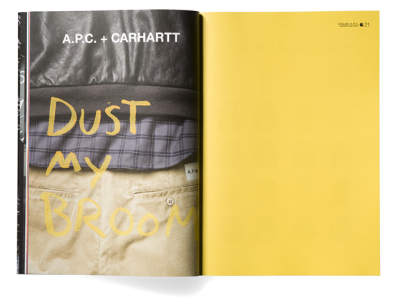
I also found this book which is the Sneaker Freaker X Nike 'Genealogu of Innovation' book. I think this layout generally reitterated the fact that I should use two column grids. I think the layout of the image on one side of the book and the type on the other is really effective and fluent through-out the book, and I think I will stick to the same grid layout through-out, just like this book does.


No comments:
Post a Comment