To begin my research, I am going to look into some grids and general publications that exist already to get a better idea of what I would like my publication to look like. I already know a bit about grids and magazine layouts, however not really about books. So this is going to be the main focus of my research for this specific brief.

This is a book layout that I found on pinterest. It can be found HERE. I think it's a really slick layout and I really like the fact the grid is different on each page, however the colour and negative space makes all the pages belong together. I think the colour scheme of black and white is incredibly effective and aesthetically pleasing as it's not harsh on the eyes and it's really interesting to look at. I think this would be quite an effective thing for me to do with my own book - to use a different grid system on each page.

This is another layout for a magazine that I found on Pinterest. It can be found HERE. Again with this design, I think the colour scheme really works as they all look like they belong together. I don't particularly like the last page, however, I think it would've looked better if it was on a white page but that's just my opinion. I think the 3 column grid works really well across each page, however I don't think this would be suitable for my book as I want it to be A5 and it would be quite difficult to read.

This is another layout that I found on Pinterest. It can be found HERE. I think it's incredibly slick and I really love how each page is an image with type over the top, instead of an image with type around it. I think the colour scheme works and I enjoy the use of the purple box that has a lowered opacity so you can still see the image behind it. It is a 4 column grid through-out and I think that it definitely works as a magazine.
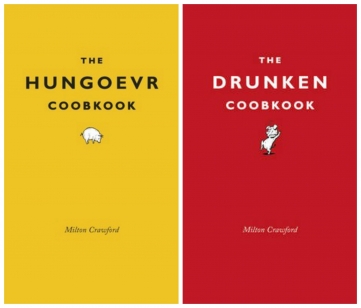
These are two books that I found out about a couple of weeks ago. I think the concept behind them is really clever and I would like to use a similar concept in my own publication, however not just on the front cover, but through-out the whole. I think this would require me to create illustrations instead of using photographs, which I think may be time consuming but would be worth it as it would look a lot better and more humourous. I definitely think I want an element of comedy in my publication, as it want it to be aimed at students and I don't think they would take it very seriously if it was a serious publication.

I am now going to look at the layout of some of the magazines that I own. This one is a Carhartt magazine. I think the layout is incredibly slick and I absolutely love the use of colour, as each double page spread. I particularly enjoy the last page of the magazine. It uses a three column grid and showcases all the previous magazines. I think the layout is really effective and definitely makes me want to buy the rest of the previous magazines and start to collect them.

I then looked at the latest Vice magazine. I also really enjoy the layout of this magazine and the double page spreads, as they're two column grids and are really clear to understand and follow. I also really enjoy the imagery used, which I think is something I should look into for my own book, as I don't think the images I have of the bottlecaps are going to work with my purpose of the book.

Cameron found a really slick layout that is relevant to my project and sent it to me. This can be seen above. I think it's a really nice design and would definitely be useful for me if I wanted my book to be serious, however I want it to be quite funny and interesting to read.
No comments:
Post a Comment