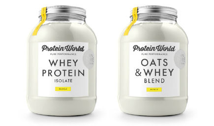
Initially, we discussed that insects are very high in protein, something we had previously seen on Bear Grylls. We started looking into different ways that protein powder has been branded.
Protein is usually branded in either large tubs or flat packets (see above images). The colour red has been proven to make people hungry, increase heart rate and to excite people.
We decided to begin trying to experiment with different logos and then come together to choose the best one. This is the best design that I created. It's very simple, and is based on the shape of a worm.
As a group, however, we all decided that Izzie's design is definitely the most successful as it was gemetric, minimal and clean. She also chose the typeface Futura, which really fit with the design.
She then mocked up the packaging to match the clean, minimal aesthetic. It appeals to the target audience of gym goers as it looks like lungs as well as insect body parts, and therefore has a double meaning - exercising gets your lungs pumping.


No comments:
Post a Comment