Before I start thinking of my own vinyl ideas, I want to research into some designs that are recognisable and have had a huge impact on the world. I think it will also be useful to see what colours and typefaces have been used, as it could influence my own choices. This album cover is for Doldinger - Jazz Made in Germany. It's created in a very modernist, minimal style. I think the album cover is very effective as the colour scheme is very eye catching, and only uses CMYK colours. It also focuses a lot on negative space around the illustration/pattern design. The typeface used is Helvetica, which I think is very successful as it makes the design look more modern.

This is a record for Design for Life 12 inch single for Manic Street Preachers by Farrow Design. This record is a Record day 2016 exclusive. It's a record I have been following for a while, as I saw Farrow Design tweet about it and I think it would be an amazing record to have in my own collection, as I really love the sleeve design. The design is simply type debossed onto a metallic stock.

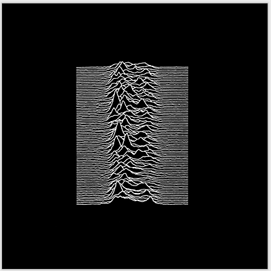
This record sleeve design is for Joy Division - Unknown Pleasures, and was designed by Peter Saville. He is well known for sleeve designs for successful artists, such as Joy Division. This design is successful and was probably the first album design of its time not to feature the artists name on the sleeve. It's successful, however simple as he literally just inverted an image that Joy Division gave to him.
The album design below is for the album 'Abbey Road' by The Beatles and was designed by Kosh/Iain MacMillan. It's incredibly effective as it symbolises the band as a whole, for example John Lennon is wearing a fully white suit and Paul McCartney is wearing no shoes. The design is considered to be incredibly British. I think it's really effective as this particular zebra crossing in London is now a type of landmark, and many tourists go there and try to take photos on the crossing in a similar style - which I'm sure would be very annoying for drivers as there will constantly be people crossing the road. There is also a website of a livecam set up of the road where you can watch people constantly crossing the road and taking pictures, which I think is really cool. The website can be found HERE.
This album cover is for the artist Bjork for the album Homogenic and was designed by Alexander McQueen. Bjork is well known for pushing the boundries for her music and has also been well known for her approach to album artwork. McQueen went with the image of Bjork being a "warrior of love". The hair alone weighed 10 kilos.
This is the album art for the album Nevermind the Bollocks by the Sex Pistols. It was designed by Jamie Reed. It is said that Reed had no interest of putting the band on the cover as "the band were ugly anyway". He used ransom-note styled lettering, incredibly striking colours and simplicity that anyone could recreate, which was perfect for the genre of the album - the DIY Punk aesthetic.
This album is for the band Pink Floyd's album called Wish You Were Here and was designed by Storm Thorgerson. Thorgerson based his design on the idea of absence, with the album shrink-wrapped in a dark colour to hide the artwork. The gesture of a handshake between the two men was inspired by Welcome to the Machine and Have a Cigar, and by the idea of people that hide their true feelings for fear of 'getting burned'.
This is the album artwork for the band Justice for the album entitled †. Justice are one of the coolest French duo's since Daft Punk. The album cover was designed by Surface2Air. Their adoption of the cross as their symbol was appropriate, given the quasi-religious following they obtained and built through the underground. The colour scheme referenced T-rex's Electric Warrior.
This was the album cover designed by Robert Fisher for the album Nevermind by Nirvana. It's an iconic image of an innocent baby swimming toward a dollar bill. Kurt Cobain apparently concieved the idea after watching a TV show about water births. The meaning of the album cover has never been released and never will be, however I imagine it to be about the corruption of the government and how we are brought up from as soon as we are born to be reliant on money.
This album cover was designed by Andy Warhol for the band The Velvet Underground. Early copies of the sleeve had the invitation to "Peel slowly and see, enabling the owner to peel back the banana skin to reveal a flesh-coloured banana underneath. The album artwork would've been successful for whichever band it was designed for, as Andy Warhol's artwork is iconic and always will be.
This cover was designed by John Squire for the band The Stone Roses. Squire was higely influenced by abstract expressionist painter Jackson Pollock. The piece referred to the May 1968 Parisian Riots - hence the coloured daubings of the French tricolore on the left. The lemons pointed to the fact that they could be used as an antidote to tear gas.
No comments:
Post a Comment