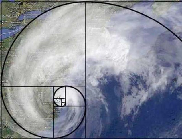
Below is the Fibonacci sequence ratio 8:13 that links to the golden section. This particular grid is not only valid in design, but also in nature. 1.62 forms the basis of paper sizes and its principles can be used as a way of creating balanced design. The results of using this specific grid are generally beautiful, for example it was used by Egyptians and also Greeks.
Some examples of the ratio I found online are below.

This is the Fibonacci ratio.


It is also said that the apple logo was designed using the golden ratio, however the designer said he didn't base it on the theory. However, it is still important to graphic designers as the logo is incredibly slick and marked a breakthrough within product design, which shows even though the ratio wasn't used, it fits and it is incredibly stunning.
The rule of thirds is a 9 section grid, mostly used within photography, however can also be applied to page layout and sometimes website layouts. The rule states that the focal point of the image should be overlapping the mark of a third of a page. This is an incredibly key rule for photographers, so much so there is a grid already on my camera for guidelines. I have tried this out myself below.


In my opinion, I think the rule definitely works as the cactus looks a lot better in the photo it is hitting the third line, whereas the photo when the cactus is very central looks quite weird, like it is missing something from the background.
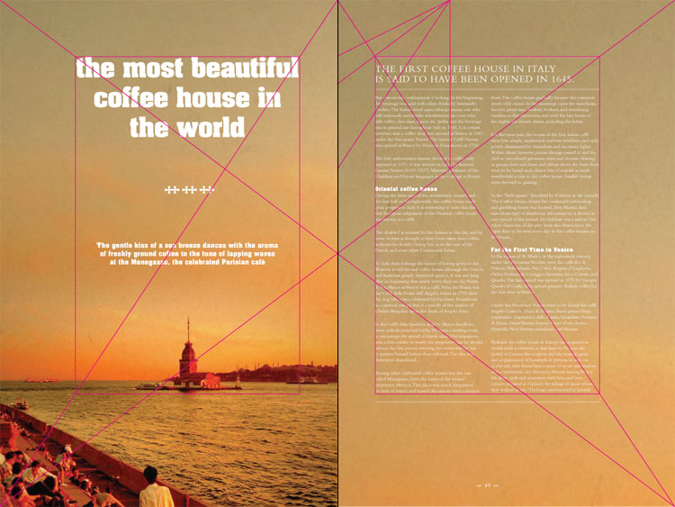
Canons are types of grids that measure and describe proportions, margins and print areas. Below is an example of a canon grid, this one is the Van De Graaf canon. To break this down, the diagonal grid markings explain where the photos or text boxes should be placed within the two pages. I think this design actually works, and is incredibly slick and means the work on the page wouldn't be overcrammed. An example of this within working design is below.

I think the use of the canon (below) is incredibly successful, as the use of the grid makes the layout work, as the focal point of the image (left) is within the rectangle, and this is similar with the type on the right hand side.
Jay Tschichold created a canon that is incredibly similar to the Van De Graaf canon, and is entitled the Golden Canon. The circle on the left shows the type area's height, and the diagonal grid shows the width.

This website HERE is particularly useful, as it basically goes through quite a lot of grids and explains why they're effective and why they're useful. As it is all on this website, I am going to add this to my favourites on my macbook so I will be able to access the information really easily. I then decided I would make my own grids on some social networking websites and some newspapers. Below are the grids that I created for both Facebook and Twitter, and funnily enough the grids are incredibly similar, which makes me question whether there is a style to follow to create a successful social networking network, or if it's just the easiest way to navigate one.


I am now going to create a grid around a few front covers of newspapers to see if they follow a specific grid or not. Below is a grid around The Daily Mail and The Independent. The Daily Mail's front page is quite different than The Independent, as it has adverts. This could also be because The Independent is considered quite classy, and is more about politics and things that matter in the world, whereas The Daily Mail is a mixture of sport, politics, local news and other articles.


No comments:
Post a Comment