The next packaging design was a design created by Ana Marta who is based in Portugal. The design is created using a calligraphic font and that works with illustrations. The bottle design is very minimal and successful due to the ingredients of the smoothie being easily recognisable. The bottles are glass, meaning the design could be screen printed onto the bottle, which is something I would have to mock up in my own design if I were to do this, as I don't think uni has a printer that prints onto glass.
https://www.behance.net/gallery/24190783/Happy-Drop
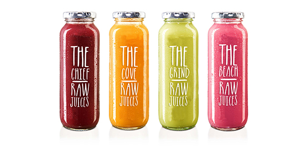
These smoothie bottles were created by the designer Lauren Nicole Foot from Vancouver. The design of these bottles is very type-based, however the spacing of the letterforms is successful and very eye catching. The typeface used is very playful and appeals to a younger demographic.
https://www.behance.net/gallery/15668277/Raw
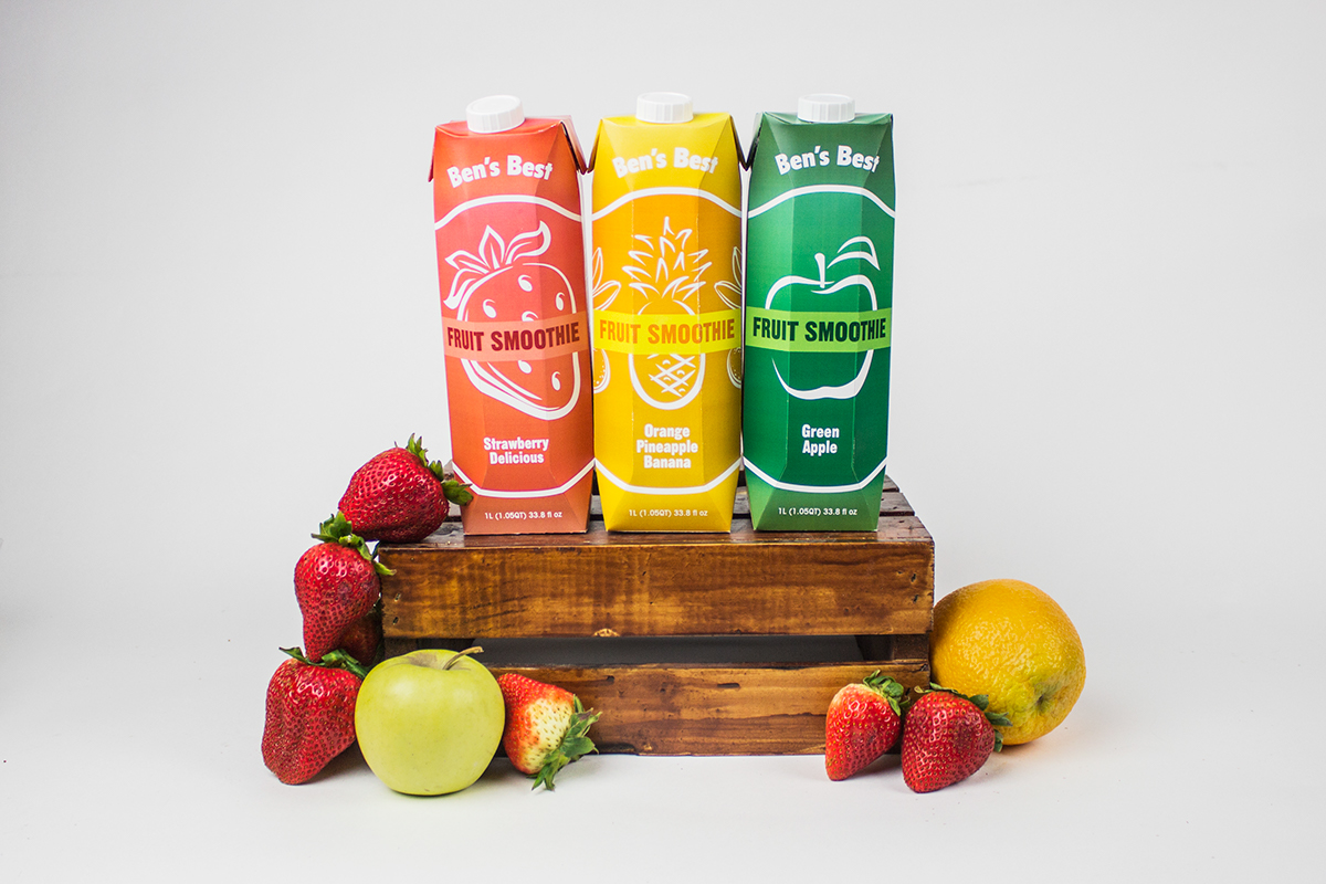
The final smoothie packaging I found was designed by Justine Comeau, a designer based in NYC. These carton designs are really slick and it is clear that the packaging follows a grid so that each flavour is consistent, even through the use of different illustrations. This is something that I will definitely have to consider. The only downfall of this project is the fact that the contents aren't visible through the packaging. When purchasing a smoothie, I think it's important to be able to see the smoothie as the bright colours often entice the buyer in.
https://www.behance.net/gallery/35892021/Smoothie-Tetrapak-Packaging


No comments:
Post a Comment