I still don't have a strong concept as of yet, so I decided it would be useful to look into packaging design, as after looking into Burt's Bees, it is clear that having an actual product can definitely help get attention and traffic to a website, so this might be beneficial for my own project. To do this, I thought it would be best to look on Behance, as this is a website that is very useful as it tells the designer and the concept behind the design. It might help my own idea generation knowing the concept behind some projects. The first project I have found is called Hexagon Honey and was designed and created by Mark Arbuzov and Pavel Gubin, who are designers based in Moscow, Russia.
"Natural forms is the best way to show naturalness of product. You need to have only form that to understand what is inside the package. Honey must look like honey. That is why this package is so clean and simple. You have to enjoy the smell and taste of honey. Nothing more should bother you."
I think this concept is very strong, and the designers are right - it is very apparent that within the bottle is honey, and it looks like a very expensive honey. The packaging adds value to the product. The colour scheme also works really well, as it is clear that the honey is the main focus of the product, not the actual packaging. The shape of the bottle is key to informing that inside is honey, not so much the packaging design.
https://www.behance.net/gallery/11750165/Hexagon-Honey
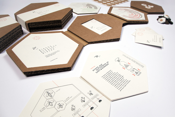
The next project I found was Busy Bees Bachelor Thesis, which was designed by Vanessa Schnurre, a designer from Kiel, Germany.
"The awareness campaign „Busy Bees“ is the implementation of the thesis "Information graphics as an instrument for sustainable communication" and is engaged with the prevailing mass death of honey bees. So as to acquire a well-founded communication concept the theoretical part of this work analyses the influencing factors that hinder an effective communication with society and elaborates the factors that are essential for an efficient conception and presentation of information graphics. The campaign aims to illustrate the function and significance of honey bees and the part they play in our ecological system. Furthermore, it communicates the sensitivity and endangerment of this dependency as an imminent risk. „Busy Bees“ arouses interest and requests assistance at the same time. The communication strategy used for this purpose is based on the following guiding idea: „Motivation instead of depression.“ Information graphics are the campaign’s picture language and information carrier."
I think the design of the thesis is very relevant and it is very clear from first glance that the project is about bees. The choice of stock is also chosen very carefully, as it seems to be printed on recycled paper, which was chosen to show the nature-esk feel of the thesis.
https://www.behance.net/gallery/13535747/BUSY-BEES-BACHELOR-THESIS
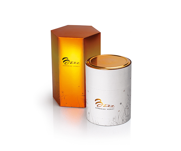
This project is called Bzzz Honey and was designed by Backbone Branding and Stepan Azaryan, who are design studios based in Armenia. I really like the packaging for this project, however I'm not a huge fan of the logo design. However, the logo and packaging design did end up winning a number of design excellence awards. It's clear to see that there is a definite pattern emerging between branding around bees, as the ones I have looked at so far are all similar colour schemes and all seem to focus around the hexagon, honey comb pattern. This is something I should definitely aim to avoid when designing my own project, as I want my project to stand out from the rest.
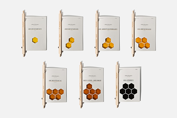
This publication is entitled 'All for one - God Save the Queen' and is a thesis created by Steffi Golla who is based in Vienna, Austria. The aim of the project was to show that honey bees achieve incredible things during their short lifespan. I think this has definitely been achieved through the multiple publications, and they all work incredibly successfully as a set. The binding method is very well informed, as it is based on part of the honey bees home - the slots that usually would have honey comb inside. The colour scheme is also relevant, as is the hexagon design, however as I have previously mentioned, this is very overdone with anything designed that relates to bees.
https://www.behance.net/gallery/2426304/Eine-fuer-Alle-Lang-lebe-die-Koenigin
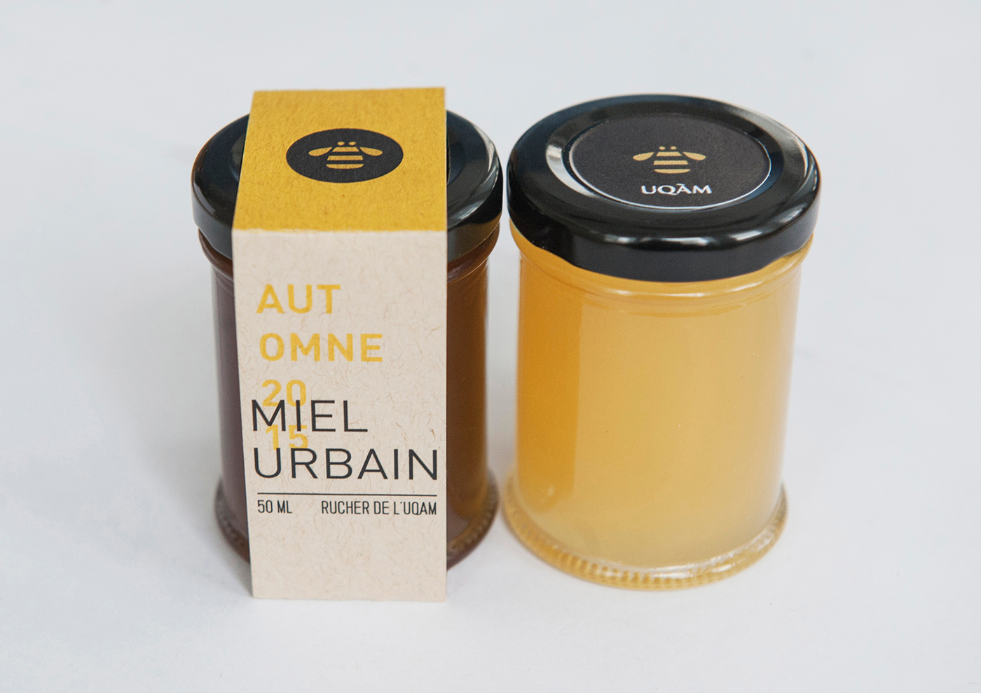
This is a product designed by the designer Laurence Gregoire who is based in Montreal. This is a design that stands out for me from the rest as it doesn't use the same repetitive hexagon pattern, however it does still use a very obvious colour scheme - however, I believe this is just because it is an informed design choice. The actual logo is very slick and fits really successfully with the packaging design.
https://www.behance.net/gallery/31901737/Miel-Urbain
From researching all of these products, I think it's obvious that I definitely won't use a hexagon pattern within my own design as it's very overdone. I will also refrain from using solely black and yellow, as this is also a very obvious choice, and although successful, makes all the products look very similar.


No comments:
Post a Comment