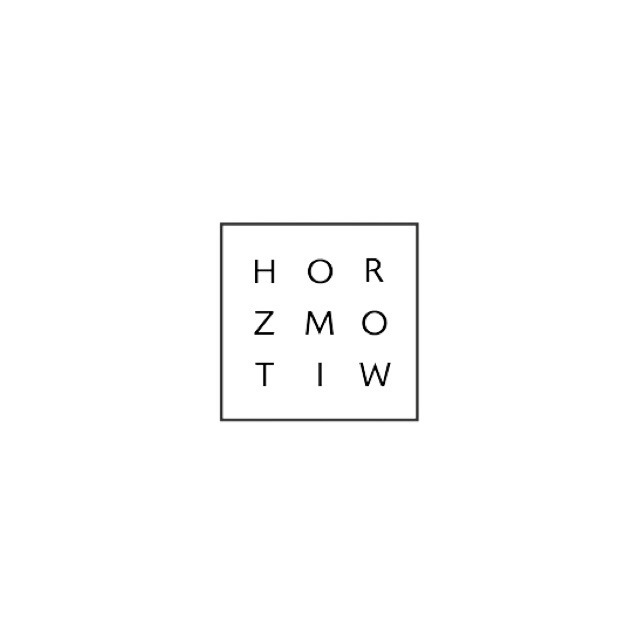
Before I start designing a logo for Lokables, I decided it would be beneficial to look at some logo designs. The design below is a self-branding logo for somebody called 'M. Horowitz'. I think the design of the logo is quite effective, however the logo reads completely wrong as it reads 'Horozmotiw'. I think if I ignore this, it's a really successful logo design as it's minimal, simple and quite slick.
The next logo design I think is incredibly successful as it's slick and relevant to the company. The company is called pagepro, and the logo icon is the letter P with paper wrapped around it. It's a successful logo design as it's recognisable as both icon and icon with text. I think the typeface fits with the logo icon really well as both are slick, sans serif typefaces.
I found this logo design on Tumblr, and I'm not really sure what the company is for, however I think it's an awesome logo design as it works upside down as well which is illustrated with the GIF. The logo design is successful as it's slick and it works very well in black and white.
I'm also not sure what this logo design is for exactly, however I think it's also successful as it is very slick and it uses negative space really effectively. It's bold and eye catching without using colour.
Finally, I found this logo design for a bakery called "Midnight Baker". I think it's a really effective logo design as the croissant is the same shape as the moon, so it's recognisable as the Midnight bakery.


No comments:
Post a Comment